 shinyChromosome:
interactive creation of non-circular whole genome diagram
shinyChromosome:
interactive creation of non-circular whole genome diagram
shinyChromosome:
interactive creation of non-circular whole genome diagram
Example 1 |
Example 2 |
Example 3 |
Example 4 |
Example 5 |
|---|---|---|---|---|
 Input files for example 1 Input files for example 1
|
 Input files for example 2
|
 Input files for example 3
|
 Input files for example 4
|
 Input files for example 5
|
Example 6 |
Example 7 |
Example 8 |
Example 9 |
Example 10 |
 Input files for example 6
|
 Input files for example 7
|
 Input files for example 8
|
 Input files for example 9
|
 Input files for example 10
|
Example 11 |
Example 12 |
Example 13 |
Example 14 |
Example 15 |
 Input files for example 11
|
 Input files for example 12
|
 Input files for example 13
|
 Input files for example 14
|
 Input files for example 15
|
Example 16 |
Example 17 |
Example 18 |
Example 19 |
Example 20 |
 Input files for example 16
|
 Input files for example 17
|
 Input files for example 18
|
 Input files for example 19
|
 Input files for example 20
|
Example 21 |
Example 22 |
Example 23 |
Example 24 |
Example 25 |
 Input files for example 21
|
 Input files for example 22
|
 Input files for example 23
|
 Input files for example 24
|
 Input files for example 25
|
Example 26 |
Example 27 |
Example 28 |
Example 29 |
Example 30 |
 Input files for example 26
|
 Input files for example 27
|
 Input files for example 28
|
 Input files for example 29
|
 Input files for example 30
|
Example 31 |
Example 32 |
Example 33 |
Example 34 |
Example 35 |
 Input files for example 31
|
 Input files for example 32
|
 Input files for example 33
|
 Input files for example 34
|
 Input files for example 35
|
Example 36 |
Example 37 |
Example 38 |
Example 39 |
Example 40 |
 Input files for example 36
|
 Input files for example 37
|
 Input files for example 38
|
 Input files for example 39
|
 Input files for example 40
|
Example 41 |
Example 42 |
Example 43 |
Example 44 |
Example 45 |
 Input files for example 41
|
 Input files for example 42
|
 Input files for example 43
|
 Input files for example 44
|
 Input files for example 45
|
Example 46 |
Example 47 |
Example 48 |
Example 49 |
Example 50 |
 Input files for example 46
|
 Input files for example 47
|
 Input files for example 48
|
 Input files for example 49
|
 Input files for example 50
|
Example 51 |
Example 52 |
Example 53 |
Example 54 |
Example 55 |
 Input files for example 51
|
 Input files for example 52
|
 Input files for example 53
|
 Input files for example 54
|
 Input files for example 55
|
Example 56 |
Example 57 |
Example 58 |
Example 59 |
Example 60 |
 Input files for example 56
|
 Input files for example 57
|
 Input files for example 58
|
 Input files for example 59
|
 Input files for example 60
|
Example 61 |
Example 62 |
Example 63 |
Example 64 |
Example 65 |
 Input files for example 61
|
 Input files for example 62
|
 Input files for example 63
|
 Input files for example 64
|
 Input files for example 65
|
shinyChromosome is a graphical user interface for interactive creation of non-circular whole genome diagrams developed using the R Shiny package.
To create single-genome plot by aligning genome data along all chromosomes of a single genome, go to the Single-genome plot menu.
To cretae two-genome plot for comparison of data across two genomes, go to the Two-genome plot menu.
For the detail format of input data, check the Input data format submenu of the Help menu.
Citation
Yu Y+, Yao W+✉, Wang Y, Huang F. shinyChromosome: An R/Shiny Application for Interactive Creation of Non-circular Plots of Whole Genomes. Genomics, Proteomics & Bioinformatics, 2020 (+ co-first author)
Software references
- R Development Core Team. R: A Language and Environment for Statistical Computing. R Foundation for Statistical Computing, Vienna. R version 3.5.0 (2018)
- RStudio and Inc. shiny: Web Application Framework for R. R package version 1.0.5 (2017)
- Lionel Henry and Hadley Wickham. rlang: Functions for Base Types and Core R and “Tidyverse” Features. R package version 0.2.1 (2018)
- H. Wickham. ggplot2: Create Elegant Data Visualisations Using the Grammar of Graphics. R package version 3.0.0 (2018)
- Gábor Csárdi, Kuba Podgórski, Rich Geldreich. zip: Cross-Platform zip Compression. R package version 2.0.2 (2019)
- Erich Neuwirth. RColorBrewer: ColorBrewer palettes. R package version 1.1-2 (2014)
- Hadley Wickham. plyr: Tools for Splitting, Applying and Combining Data. R package version 1.8.4 (2016)
- Jeffrey B. Arnold. ggthemes: Extra Themes, Scales and Geoms for “ggplot2”. R package version 3.4.0 (2017)
- Christoph Burow, Urs Tilmann Wolpert and Sebastian Kreutzer. RLumShiny: “Shiny” Applications for the R Package “Luminescence”. R package version 0.2.0 (2017)
- Baptiste Auguie. gridExtra: Miscellaneous Functions for “Grid” Graphics. R package version 2.3 (2017)
- Hadley Wickham. reshape2: Flexibly Reshape Data: A Reboot of the Reshape Package. R package version 1.4.3 (2017)
- Matt Dowle and Arun Srinivasan. data.table: Extension of “data.frame”. R package version 1.10.4-3 (2017)
- JJ Allaire, Jeffrey Horner, Vicent Marti and Natacha Porte. markdown: “Markdown” Rendering for R. R package version 0.8 (2017)
Further references
This application was created by Yiming Yu and Wen Yao. Please send bugs and feature requests to Yiming Yu (yimingyyu at gmail.com) or Wen Yao (venyao at qq.com). This application uses the shiny package from RStudio.
Note
For Mac users, we recommend using shinyChromosome with the Google Chrome browser or other browsers developed based on Chrominum.
Input data format
The detailed format of input data for different types of plots are described in the following sections.
1. Single-genome plot
1.1 Genome data
The dataset should contain only 2 columns with fixed order. Column names are optional.
1st column: chromosome ID.
2nd column: chromosome length.
Acceptable input data format can be
 chr     size
   1 43268879
   2 35930381
   3 36406689
or
1	43268879
2	35930381
3	36406689
1.2 Point
The dataset should contain >=3 columns.
In the simplest situation, the dataset should contain 3 columns with fixed order. In this case, column names are optional.
1st column: chromosome ID.
2nd column: chromosome position.
3rd column: data value.
Acceptable input data format can be
 chr position    value
   1   202360 0.315323
   1   213775 1.113439
   1   218457 0.393112
or
1	202360	0.315323
1	213775	1.113439
1	218457	0.393112
To control the color of points, add a color column to categorize the data into different groups. Then different colors will be assigned to different groups of data. In this case, column names are compulsory. The name of the first three columns can be any appropriate variable names in R and the order of the first three columns must be fixed as the simplest situation. The name of the color column must be ‘color’.
 chr position    value color
   1   202360 0.315323     a
   1   213775 1.113439     a
   1   218457 0.393112     a
To control the symbol used for each point, add a shape column. Check http://www.endmemo.com/program/R/pchsymbols.php for more information. In this case, column names are compulsory. The name of the first three columns can be any appropriate variable names in R and the order of the first three columns must be fixed as the simplest situation. The name of the shape column must be ‘shape’.
 chr position value shape
   1        1    29    15
   1   100001    18    15
   1   200001    22    15
To control the size of each point, add a size column. Larger number in the size column means lareger point size. In this case, column names are compulsory. The name of the first three columns can be any appropriate variable names in R and the order of the first three columns must be fixed as the simplest situation. The name of the size column must be ‘size’.
 chr position value size
   1        1    29  1.1
   1   100001    18  1.0
   1   200001    22  1.1
Users can choose to control two or more of the color, shape and size features at the same time. In this case, column names are compulsory. The name of the first three columns can be any appropriate variable names in R and the order of the first three columns must be fixed as the simplest situation. The name of the shape column must be ‘shape’. The name of the color column must be ‘color’. The name of the size column must be ‘size’. The order of the color, shape and size columns is flexible. Acceptable input data can be
 chr position value color shape
   1        1    29     a    15
   1   100001    18     a    15
   1   200001    22     a    15
or
 chr position value color shape size
   1        1    29     a    15  1.1
   1   100001    18     a    15  1.0
   1   200001    22     a    15  1.1
or
 chr position value color size
   1        1    29     a  1.1
   1   100001    18     a  1.0
   1   200001    22     a  1.1
or
 chr position value shape size
   1        1    29    15  1.1
   1   100001    18    15  1.0
   1   200001    22    15  1.1
1.3 Line
The dataset should contain >=3 columns.
In the simplest situation, the dataset should contain 3 columns with fixed order. In this case, column names are optional.
1st column: chromosome ID.
2nd column: chromosome position.
3rd column: data value.
Acceptable input data format can be
 chr position  value
   1        0 0.0428
   1   565000 0.0522
   1   599000 0.0674
or
1	     0	0.0428
1	565000	0.0522
1	599000	0.0674
To add multiple lines and assign different colors to different lines, add a color column to categorize the data into different groups. In this case, column names are compulsory. The name of the first three columns can be any appropriate variable names in R and the order of the first three columns must be fixed as the simplest situation. The name of the color column must be ‘color’.
 chr position value color
   1        1    29     a
   1   100001    18     a
   1        1     4     b
   1   200001     5     b
1.4 Bar
The dataset should contain >=4 columns.
In the simplest situation, the dataset should contain 4 columns with fixed order. In this case, column names are optional.
1st column: chromosome ID.
2nd column: start coordinate of bars.
3rd column: end coordinate of bars.
4th column: data value.
Acceptable input data format can be
 chr  start    end value
   1      1 100000   672
   1 100001 200000   486
   1 200001 300000   650
or
1	     1	100000	672
1	100001	200000	486
1	200001	300000	650
To control the color of bars, add a color column to categorize the data into different groups. Then different colors will be assigned to different groups of data. In this case, column names are compulsory. The name of the first four columns can be any appropriate variable names in R and the order of the first four columns must be fixed as the simplest situation. The name of the color column must be ‘color’.
 chr  start    end  value color
   1      0 565000 0.5923     a
   1 565000 599000 0.6701     a
   1 599000 922000 0.6785     a
1.5 Rect
The dataset should contain 4 columns with fixed order. Column names are optional.
1st column: chromosome ID.
2nd column: start coordinate of rects.
3rd column: end coordinate of rects.
4th column: data value.
The 4th column can be a character vector or a numeric vector. For a character vector, choose the rect_discrete plot type. For a numeric vector, choose the rect_gradual plot type.
Acceptable input data format can be
 chr  start    end color
   1      1 100000     A
   1 100001 200000     C
   1 200001 300000     A
or
1	     1	100000	A
1	100001	200000	C
1	200001	300000	A
or
 chr  start    end NTE
   1      1 100000  29
   1 100001 200000  18
   1 200001 300000  22
or
1	     1	100000	29
1	100001	200000	18
1	200001	300000	22
1.6 Heatmap
The dataset should contain >=4 columns. Column names are optional. The order of the first three columns must be fixed as follows.
1st column: chromosome ID.
2nd column: start coordinate of cells.
3rd column: end coordinate of cells.
Except for the first three columns, all the rest columns are treated as data values by shinyChromosome.
The rest columns can be character vectors or numeric vectors. Mix of character vector and numeric vector are not allowed.
For character vectors, choose the heatmap_discrete plot type. For numeric vectors, choose the heatmap_gradual plot type.
Acceptable input data format can be
 chr   start     end val1 val2 val3 val4 val5 val6
   1       0  631164    a    e    c    c    a    b
   1  631165 1749192    b    b    c    d    d    c
   1 1749193 2077793    c    e    a    b    e    e
or
1	      0	 631164	a	e	c	c	a	b
1	 631165	1749192	b	b	c	d	d	c
1	1749193	2077793	c	e	a	b	e	e
or
 chr    start      end TE NTE TR NTR
   1        1   100000  4  29 17  45
   1 10000001 10100000  9  14 20  28
   1  1000001  1100000  1  16 -5  29
or
1	       1	  100000	4	29	17	45
1	10000001	10100000	9	14	20	28
1	 1000001	 1100000	1	16	-5	29
1.7 Segment
The dataset should contain 5 columns with fixed order. Column names are optional.
1st column: chromosome ID.
2nd column: X-axis start coordinate of segments.
3rd column: Y-axis start coordinate of segments.
4th column: X-axis end coordinate of segments.
5th column: Y-axis end coordinate of segments.
Acceptable input data format can be
 chr   xstart ystart     xend yend
   1   134291      0   134291  2.8
   1  2665412      0  2665412  2.8
   1 24392841      0 24392841  2.8
or
1	  134291	0	  134291	2.8
1	 2665412	0	 2665412	2.8
1	24392841	0	24392841	2.8
1.8 Text
The dataset should contain 4 columns with fixed order. Column names are optional.
1st column: chromosome ID.
2nd column: X-axis position of texts.
3rd column: Y-axis position of texts.
4th column: the symbols of texts.
Acceptable input data format can be
 chr     xpos ypos  symbol
   1   134291    3 OsTLP27
   1  2665412    3    MT2D
   1 24392841    3   OCPI1
or
1	  134291	3	OsTLP27
1	 2665412	3	   MT2D
1	24392841	3	  OCPI1
1.9 Vertical line
The dataset should contain 2 columns with fixed order. Column names are optional.
1st column: chromosome ID.
2nd column: genomic position of vertical lines.
Acceptable input data format can be
 chr position
   1        0
   1 43268879
   2 35930381
or
1	       0
1	43268879
2	35930381
1.10 Horizontal line
The dataset should contain 1 column. Column names are optional.
1st column: Y-axis value of horizontal lines.
Acceptable input data format can be
 position
        8
       12
        5
or
 8
12
 5
1.11 Ideogram
Ideogram is a schematic representation of chromosomes. Please check https://www.nature.com/scitable/topicpage/chromosome-mapping-idiograms-302 and http://genome.ucsc.edu/cgi-bin/hgTables?db=hg38&hgta_group=map&hgta_track=cytoBand&hgta_table=cytoBand&hgta_doSchema=describe+table+schema for more information. The input data to create ideogram should contain 5 columns with fixed order. Column names are optional.
1st column: chromosome ID.
2nd column: Start coordinate in chromosome sequence.
3rd column: End coordinate in chromosome sequence.
4th column: Name of cytogenetic band.
5th column: Giesma stain results.
Acceptable input data format can be
1	     1	 399271	p36.33	  gneg
1	399271	 937418	p36.32	gpos25
1	937418	1249890	p36.31	  gneg
2. Two-genome plot
2.1 Data of genome along the horizontal axis
The dataset should contain only 2 columns with fixed order. Column names are optional.
1st column: chromosome ID.
2nd column: chromosome length.
Acceptable input data format can be
 chr     size
   1 43268879
   2 35930381
   3 36406689
or
1	43268879
2	35930381
3	36406689
2.2 Data of genome along the vertical axis
The dataset should contain only 2 columns with fixed order. Column names are optional.
1st column: chromosome ID.
2nd column: chromosome length.
Acceptable input data format can be
   chr     size
 Chr01 41185095
 Chr02 34608401
 Chr03 37032663
or
Chr01	41185095
Chr02	34608401
Chr03	37032663
2.3 Point
The dataset should contain >=4 columns.
In the simplest situation, the dataset should contain 4 columns with fixed order. In this case, column names are optional.
1st column: chromosome ID of genome along the horizontal axis.
2nd column: chromosome position in genome along the horizontal axis.
3rd column: chromosome ID of genome along the horizontal axis.
4th column: chromosome position in genome along the vertical axis.
Acceptable input data format can be
 chrX     posX chrY     posY
    4 23006000    6 27706220
    6 26269000    6 27706227
   11 17015000    6 27706228
or
 4	23006000	6	27706220
 6	26269000	6	27706227
11	17015000	6	27706228
To control the color of points, add a color column. In this case, column names are compulsory. The name of the first four columns can be any appropriate variable names in R and the order of the first four columns must be fixed as the simplest situation. The name of the color column must be ‘color’. The color column can be a character vector or a numeric vector. If the color column is a character vector, choose the point_discrete plot type.
 chrX     posX chrY     posY color
    1 15414550    1 17415683     a
    1  2314068    1  2291659     a
    1  2583523    1  2546654     c
If the color column is a numeric vector, choose the point_gradual plot type.
 chrX     posX chrY     posY  color
    4 23006000    6 27706220  5.222
    6 26269000    6 27706227 10.424
   11 17015000    6 27706228  5.802
To control the symbol used for each point, add a shape column. Check http://www.endmemo.com/program/R/pchsymbols.php for more information. In this case, column names are compulsory. The name of the first four columns can be any appropriate variable names in R and the order of the first four columns must be fixed as the simplest situation. The name of the shape column must be ‘shape’. The shape column should be an integer vector.
 chrX     posX chrY     posY shape
    1 15414550    1 17415683    12
    1  2314068    1  2291659    12
    1  2583523    1  2546654    12
To control the size of each point, add a size column. Larger number in the size column means lareger point size. In this case, column names are compulsory. The name of the first four columns can be any appropriate variable names in R and the order of the first four columns must be fixed as the simplest situation. The name of the size column must be ‘size’. The size column should be an integer vector.
 chrX     posX chrY     posY size
    1 15414550    1 17415683  1.2
    1  2314068    1  2291659  1.2
    1  2583523    1  2546654  1.2
Acceptable input data can also be
 chrX     posX chrY     posY color shape
    1 15414550    1 17415683     a    12
    1  2314068    1  2291659     a    12
    1  2583523    1  2546654     c    12
or
 chrX     posX chrY     posY color size
    1 15414550    1 17415683     a  1.2
    1  2314068    1  2291659     a  1.2
    1  2583523    1  2546654     c  1.2
or
 chrX     posX chrY     posY shape size
    1 15414550    1 17415683    12  1.2
    1  2314068    1  2291659    12  1.2
    1  2583523    1  2546654    12  1.2
or
 chrX     posX chrY     posY color shape size
    1 15414550    1 17415683     a    12  1.2
    1  2314068    1  2291659     a    12  1.2
    1  2583523    1  2546654     c    12  1.2
2.4 Segment
The dataset should contain >=6 columns.
In the simplest situation, the dataset should contain 6 columns with fixed order. In this case, column names are optional.
1st column: chromosome ID of genome along the horizontal axis.
2nd column: X-axis start coordinate of segments.
3rd column: X-axis end coordinate of segments.
4th column: chromosome ID of genome along the vertical axis.
5th column: Y-axis start coordinate of segments.
6th column: Y-axis end coordinate of segments.
Acceptable input data can be
  chrX startX stopX  chrY startY stopY
 Chr01    101 21963 Chr01  19600 41490
 Chr01  25221 49370 Chr01  41483 65682
 Chr01  49604 67964 Chr01  65681 84044
or
Chr01	  101	21963	Chr01	19600	41490
Chr01	25221	49370	Chr01	41483	65682
Chr01	49604	67964	Chr01	65681	84044
To control the color of segments, add a color column to categorize data into different groups. Then different colors will be assigned to different groups of data. In this case, column names are compulsory. The name of the first six columns can be any appropriate variable names in R and the order of the first six columns must be fixed as the simplest situation. The name of the color column must be ‘color’.
  chrX   startX    stopX  chrY   startY    stopY color
 Chr01        1 35619588 Chr01        1 36185095     a
 Chr02 35140161        1 Chr02 34608401        1     b
 Chr03        1 33736842 Chr03 37032663        1     c
2.5 Rect
The dataset should contain 7 columns with fixed order. Column names are optional.
1st column: chromosome ID of genome along the horizontal axis.
2nd column: X-axis start coordinate of rects.
3rd column: X-axis end coordinate of rects.
4th column: chromosome ID of genome along the vertical axis.
5th column: Y-axis start coordinate of rects.
6th column: Y-axis end coordinate of rects.
7th column: the color of rects.
The 7th column can be a character vector or a numeric vector. For a character vector, choose the rect_discrete plot type. For a numeric vector, choose the rect_gradual plot type.
Acceptable input data format can be
 chrx startx   stopx chry  starty   stopy color
    1      1 1000000    1       1 1000000    41
    1      1 1000000    1 1000001 2000000    43
    1      1 1000000    1 2000001 3000000    59
or
 chrx startx   stopx chry  starty   stopy color
    1      1 1000000    1       1 1000000     b
    1      1 1000000    1 1000001 2000000     b
    1      1 1000000    1 2000001 3000000     b
Section
章节
Language
语言
shinyChromosome is an R/Shiny application for interactive creation of non-circular plots of whole genomes.
1. Use shinyChromosome online
shinyChromosome is deployed at http://venyao.xyz/shinyChromosome/, http://shinychromosome.ncpgr.cn/ and https://yimingyu.shinyapps.io/shinychromosome/, for online use. Users can choose to use shinyChromosome by accessing any of the three URLs based on the accessing speed. shinyChromosome is idle until you activate it by accessing the URL. So, it may take some time when you access the URL for the first time. Once it was activated, shinyChromosome could be used smoothly and easily.
2. Interface of shinyChromosome
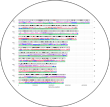
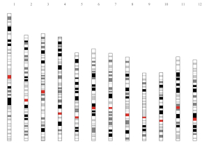
The shinyChromosome application contains 5 main menus, “Single-genome plot”, “Two-genome plot”, “Gallery”, “Help” and “About” (Figure 1). The “Help” menu includes three submenus as “Usage and installation”, “Input data format” and “User manual”. The “About” menu gives a brief overview of the shinyChromosome application, including tutorial messages and list of the R packages used by shinyChromosome.
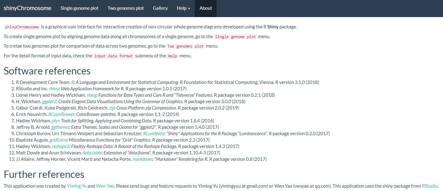
Figure 1. The “About” menu of the shinyChromosome application.
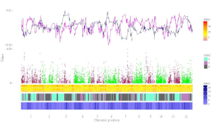
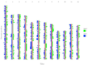
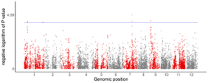
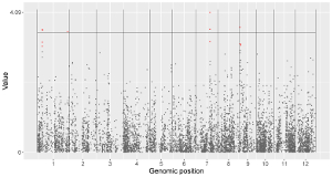
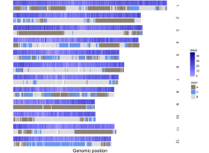
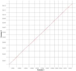
The “Single-genome plot” menu allows uploading of input data to create non-circular plots along all chromosomes of a single genome (Figure 2). On the left of the “Single-genome plot” menu is the options panel, which contains many widgets to accept user inputs. When suitable data are uploaded and plot options are properly set, the result plot can be created and displayed in the plot region of the main panel. The three “Download” buttons on top of the plot region of the main panel is provided for users to download the result plot in PDF or SVG format, as well as the R scripts and user-uploaded input datasets to reproduce the plot.

Figure 2. The “Single-genome plot” menu of the shinyChromosome application.
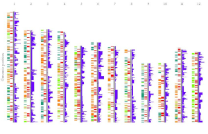
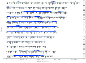
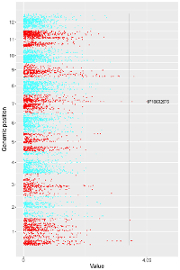
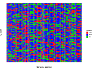
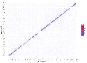
The “Two-genome plot” menu allows uploading of input data to create two-genome plots for comparison of data across two genomes (Figure 3). The left panel of the “Two-genome plot” menu contains many widgets to accept user inputs. When suitable data are uploaded and plot options are properly set, the result plot could be created and displayed in the main plot region. The three “Download” buttons on top of the main plot region is provided for users to download the result plot and the R scripts to reproduce the plot.

Figure 3. The “Two-genome plot” menu of the shinyChromosome application.
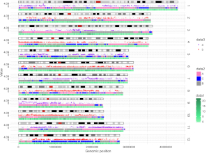
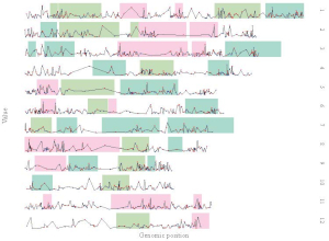
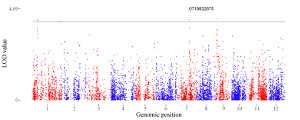
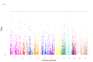
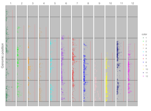
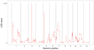
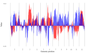
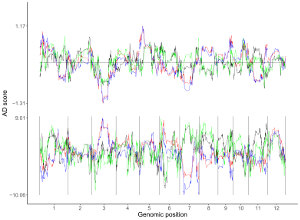
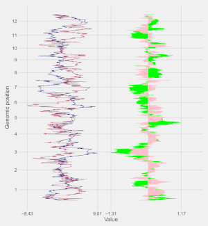
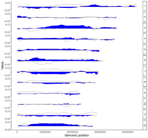
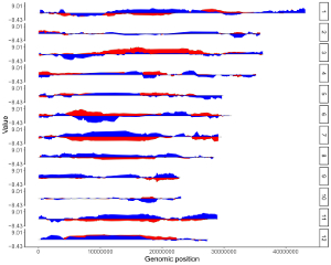
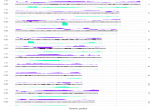
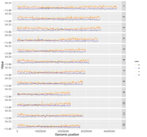
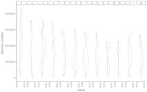
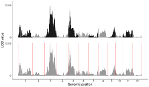
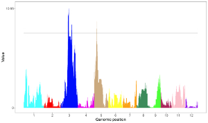
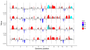
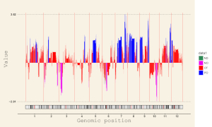
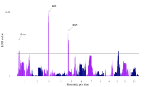
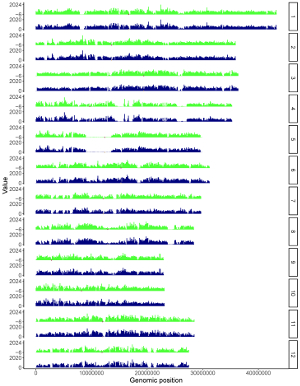
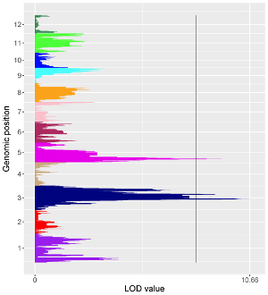
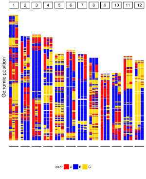
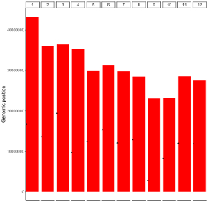
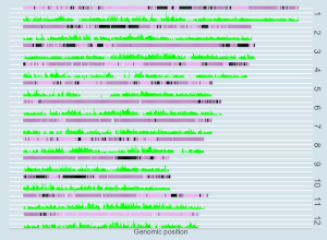
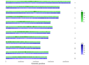
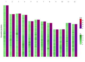
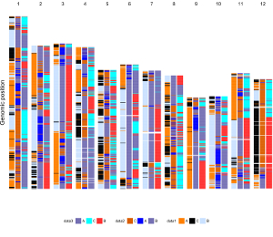
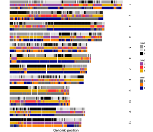
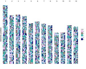
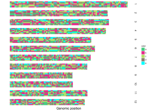
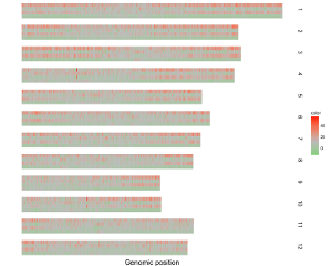
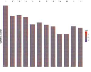
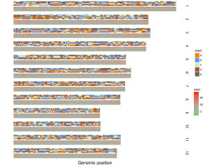
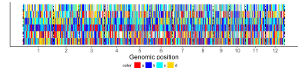
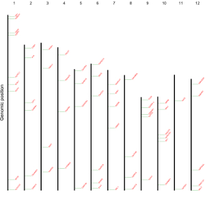
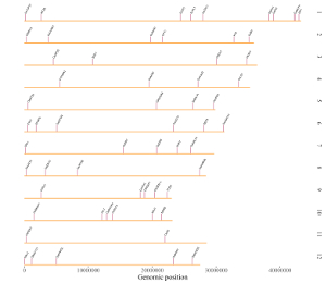
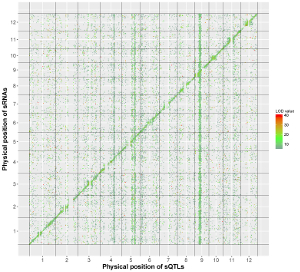
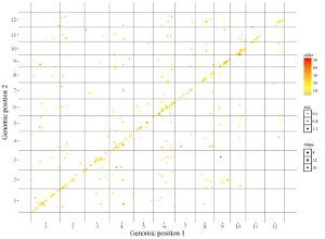
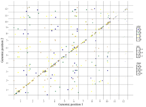
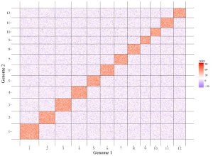
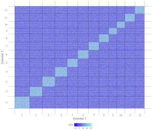
A total of 65 example figures created using shinyChromosome are listed in the “Gallery” menu of the shinyChromosome application (Figure 4). The dataset used to generate each example figure is provided for downloading, which contains all the input files with proper file names indicating the track index and plot type corresponds to each file in the dataset.
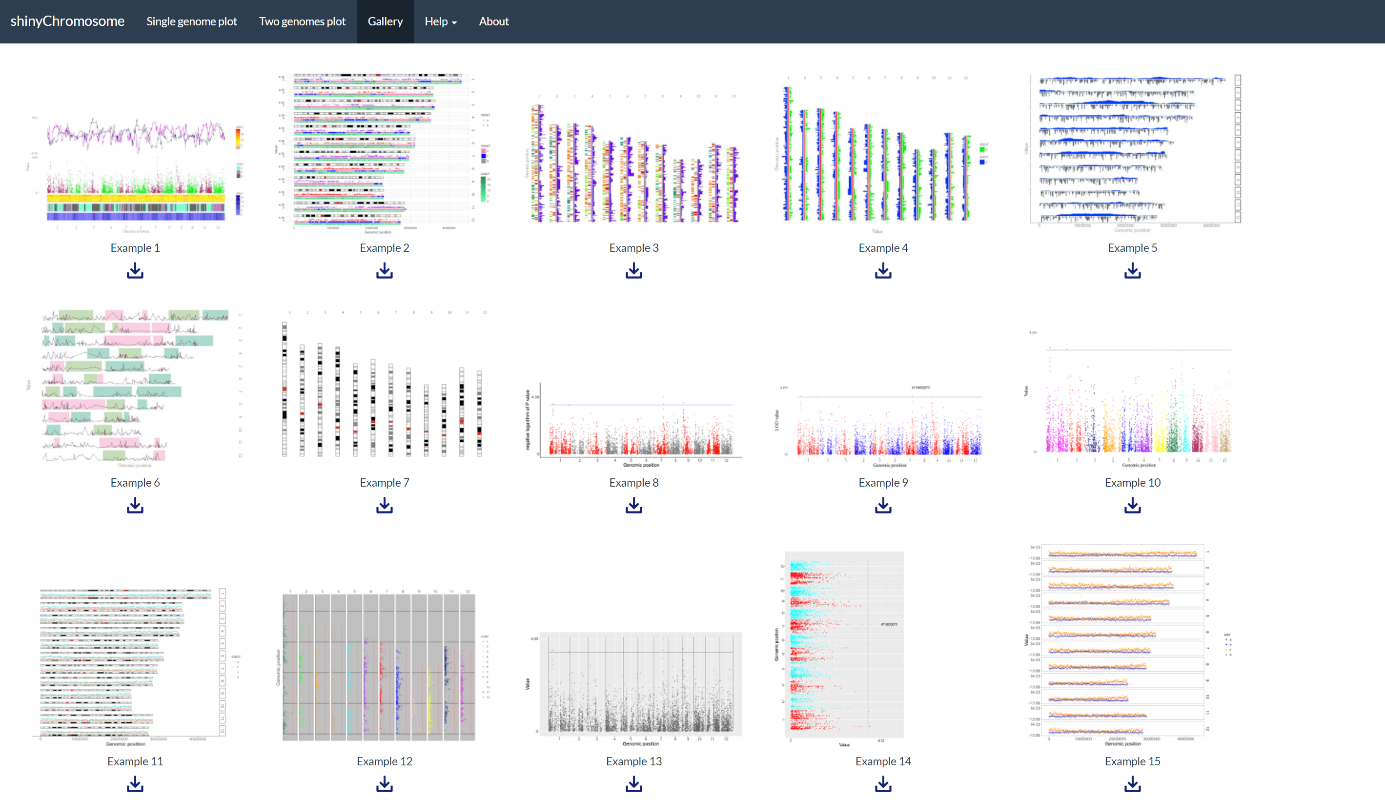
Figure 4. The “Gallery” menu of the shinyChromosome application.
The “Usage and installation” submenu of shinyChromosome provides the usage of shinyChromosome through different approaches (Figure 5).
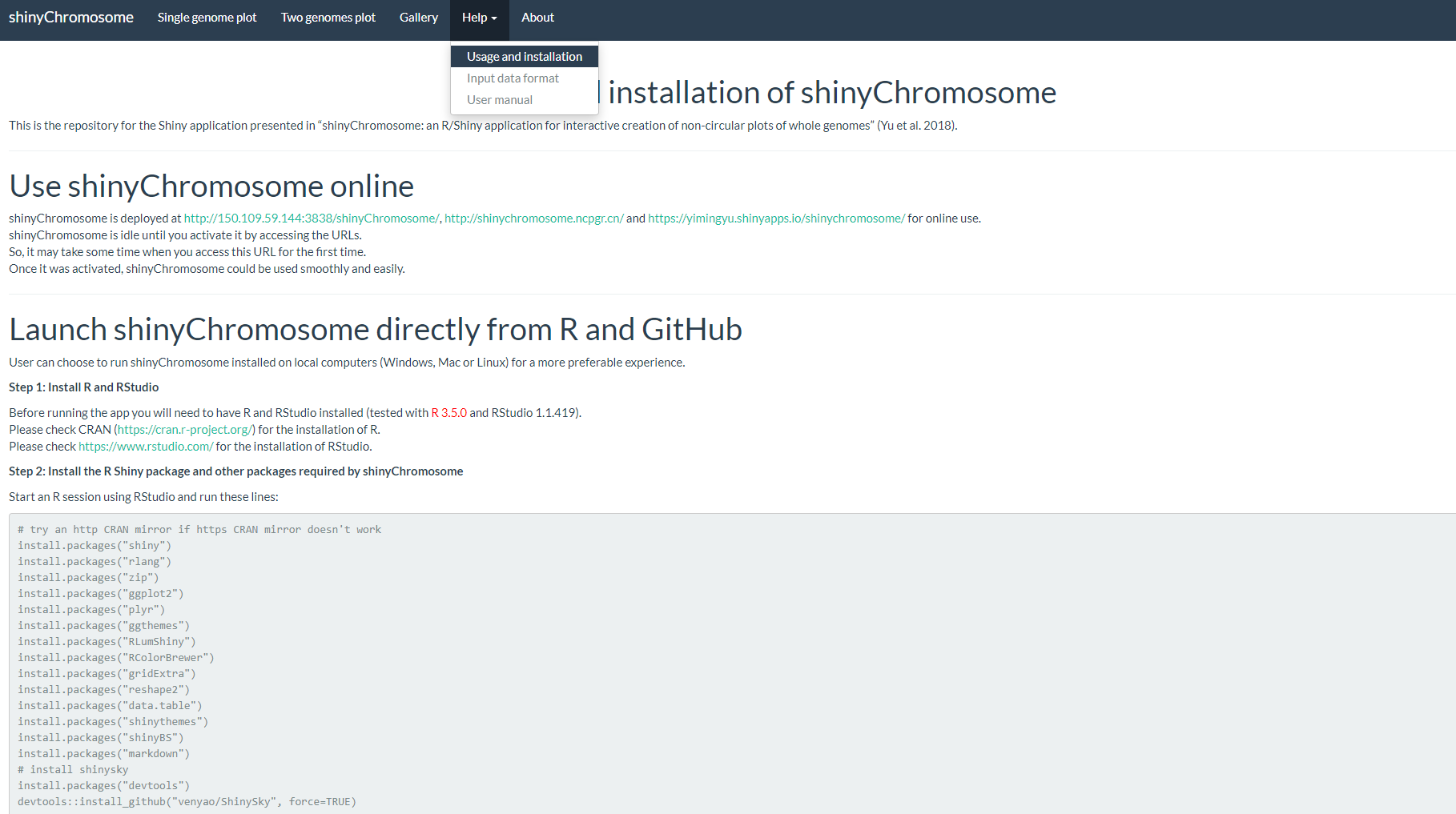
Figure 5. The “Usage and installation” submenu of the shinyChromosome application.
The “Input data format” submenu provides the detailed format of input data to create different types of plots using shinyChromosome (Figure 6).

Figure 6. The “Input data format” submenu of the shinyChromosome application.
The “User manual” submenu of shinyChromosome provides this user manual in PDF format (Figure 7).

Figure 7. The “User manual” submenu of the shinyChromosome application.
3. Usage and installation of shinyChromosome
User can choose to install and run shinyChromosome on personal computers (Windows, Mac or Linux) without uploading data to online servers. Installation of shinyChromosome is platform independent, i.e., shinyChromosome can be installed on any platform with the R environment available. Installation of shinyChromosome includes 3 steps.
3.1 Use shinyChromosome online
shinyChromosome is deployed at https://venyao.xyz/shinyChromosome/, https://venyao.shinyapps.io/shinyChromosome/ and https://yimingyu.shinyapps.io/shinychromosome/ for online use.
shinyChromosome is idle until you activate it by accessing the URLs.
So, it may take some time when you access this URL for the first time.
Once it was activated, shinyChromosome could be used smoothly and easily.
3.2 Launch shinyChromosome directly from R and GitHub
User can choose to run shinyChromosome installed on local computers (Windows, Mac or Linux) for a more preferable experience.
Step 1: Install R and RStudio
Before running the app you will need to have R and RStudio installed (tested with R 3.5.0 and RStudio 1.1.419).
Please check CRAN (https://cran.r-project.org/) for the installation of R.
Please check https://www.rstudio.com/ for the installation of RStudio.
Step 2: Install the R Shiny package and other packages required by shinyChromosome
Start an R session using RStudio and run these lines:
# try an http CRAN mirror if https CRAN mirror doesn't work
install.packages("shiny")
install.packages("rlang")
install.packages("zip")
install.packages("ggplot2")
install.packages("plyr")
install.packages("ggthemes")
install.packages("RLumShiny")
install.packages("RColorBrewer")
install.packages("gridExtra")
install.packages("reshape2")
install.packages("data.table")
install.packages("shinythemes")
install.packages("shinyBS")
install.packages("markdown")
# install shinysky
install.packages("devtools")
devtools::install_github("venyao/ShinySky", force=TRUE)
Step 3: Start the app
Start an R session using RStudio and run these lines:
shiny::runGitHub("shinyChromosome", "venyao")
This command will download the code of shinyChromosome from GitHub to a temporary directory of your computer and then launch the shinyChromosome app in the web browser. Once the web browser was closed, the downloaded code of shinyChromosome would be deleted from your computer. Next time when you run this command in RStudio, it will download the source code of shinyChromosome from GitHub to a temporary directory again. This process is frustrating since it takes some time to download the code of shinyChromosome from GitHub.
Then you can start the shinyChromosome app by running these lines in RStudio.
library(shiny)
runApp("E:/apps/shinyChromosome-master", launch.browser = TRUE)
3.3 Deploy shinyChromosome on local or web Linux server
Step 1: Install R
Please check CRAN (https://cran.r-project.org/) for the installation of R.
Step 2: Install the R Shiny package and other packages required by shinyChromosome
Start an R session and run these lines in R:
# try an http CRAN mirror if https CRAN mirror doesn't work
install.packages("shiny")
install.packages("rlang")
install.packages("zip")
install.packages("ggplot2")
install.packages("plyr")
install.packages("ggthemes")
install.packages("RLumShiny")
install.packages("RColorBrewer")
install.packages("gridExtra")
install.packages("reshape2")
install.packages("data.table")
install.packages("shinythemes")
install.packages("shinyBS")
install.packages("markdown")
# install shinysky
install.packages("devtools")
devtools::install_github("venyao/ShinySky", force=TRUE)
For more information, please check the following pages:
https://cran.r-project.org/web/packages/shiny/index.html
https://github.com/rstudio/shiny
https://shiny.rstudio.com/
Step 3: Install Shiny-Server
Please check the following pages for the installation of shiny-server.
https://www.rstudio.com/products/shiny/download-server/
https://github.com/rstudio/shiny-server/wiki/Building-Shiny-Server-from-Source
Step 4: Upload files of shinyChromosome
Put the directory containing the code and data of shinyChromosome to /srv/shiny-server.
Step 5: Configure shiny server (/etc/shiny-server/shiny-server.conf)
# Define the user to spawn R Shiny processes
run_as shiny;
# Define a top-level server which will listen on a port
server {
 # Use port 3838
 listen 3838;
 # Define the location available at the base URL
 location /shinychromosome {
 # Directory containing the code and data of shinyChromosome
 app_dir /srv/shiny-server/shinyChromosome;
 # Directory to store the log files
 log_dir /var/log/shiny-server;
 }
}
Step 6: Change the owner of the shinyChromosome directory
$ chown -R shiny /srv/shiny-server/shinyChromosome
Step 7: Start Shiny-Server
$ start shiny-server
Now, the shinyChromosome app is available at http://IPAddressOfTheServer:3838/shinyChromosome/.
Contents
3. Installation of shinyChromosome on personal computers
3.1 Use shinyChromosome online
3.2 Launch shinyChromosome directly from R and GitHub
Step 1: Install R and RStudio
Step 2: Install the R Shiny package and other packages required by shinyChromosome
Step 3: Start the app
3.3 Deploy shinyChromosome on local or web Linux server
4. Creation of non-circular single-genome plots using shinyChromosome
To create a non-circular single-genome plot, you need to use the ;Single-genome plot menu of the shinyChromosome application. A dataset to define the genome used in the single-genome plot and the other 1-10 datasets to be displayed along all the chromosomes of the genome are the compulsory input data to make a single-genome plot. In the following section, we demonstrate all the essential steps to create a non-circular single-genome plot using shinyChromosome with example datasets.
4.1 Essential steps to create a non-circular single-genome plot
Step 1. Prepare and upload the input file of the genome data
The genome data is compulsory and defines the frame of a non-circular plot (An example dataset is available at https://github.com/venyao/shinyChromosome/blob/master/www/data/download_example_data/single_genome/genome_data.txt). The genome data is basically a text file with 2 columns (Figure 11). The 1st column is the chromosome ID. The 2nd column is the chromosome length. The detailed format of the genome data is illustrated in the Input data format menu (Under the Help menu) of the shinyChromosome application. The content of the Input data format menu is also available in GitHub (https://github.com/venyao/shinyChromosome/blob/master/In_Data_Format.md).

Figure 11. The format of input file for genome data.
Here, we have prepared this file and stored this file on the disk (For example E:/ on Windows). Next, we need to upload this file to the shinyChromosome application using the Browse… widget below the Upload genome data indicator in the left panel of the Single-genome plot menu of the shinyChromosome application (Figure 12).

Figure 12. Essential steps to create a single-genome plot using shinyChromosome. The file genome_data.txt is uploaded to the genome data widget. The file point.txt is uploaded to the Data1 track while the file bar.txt is uploaded to the Data2 track.
Step 2. Upload other input datasets to be displayed along all chromosomes of the input genome
1-10 datasets could be then uploaded to be displayed along all chromosomes of the genome data uploaded in Step 1. The ten DataX (Data1 to Data10) checkbox on the left panel of the Single-genome plot menu are provided for this purpose (Figure 12). Here, we use two input datasets (https://github.com/venyao/shinyChromosome/blob/master/www/data/download_example_data/single_genome/point.txt and https://github.com/venyao/shinyChromosome/blob/master/www/data/download_example_data/single_genome/bar.txt) to demonstrate this process. The detailed format of input files to create different types of plots are illustrated in the Input data format submenu of the shinyChromosome application (Figure 6). Here, we have prepared the two files and stored them on the disk (For example E:/ on Windows). To upload the file point.txt to the Data1 track, check the Data1 checkbox, choose the Upload input data radio button and then use the Browse… widget to upload the point.txt from the disk (Figure 12). To upload the file bar.txt to the Data2 track, check the Data2 checkbox, choose the Upload input data radio button and then use the Browse… widget to upload the bar.txt from the disk.
Step 3. Set track index and plot type for each input dataset
By default, the track index for each input dataset is track1 and the plot type for each input dataset is point . We need to set the track index as track2 and the plot type as bar for the input file bar.txt as we want to use this file to create a bar plot (Figure 12).
Step 4. Click the Go! button to make the plot
After all the input datasets has been successfully uploaded to the shinyChromosome application and the track index and plot type have been set properly, we need to click the Go! button at the bottom of the left panel of the Single-genome plot menu to tell shinyChromosome to make the plot (Figure 12). The plot shown in the main panel of Figure 12 is the plot generated using the input datasets uploaded in Step 1 and Step 2. By default, random color or predefined colors would be used by shinyChromosome when generating the plot.
4.2 Turn off an input dataset used to make a single-genome plot
For each DataX checkbox on the left panel of the Single-genome plot menu, we provide two radio button options: Disable data input and Upload input data . By default, the Disable data input radio button is checked. The Upload input data is used to upload an input dataset while the Disable data input is used to turn off an input dataset already uploaded.
In section 4.1, we uploaded the input files point.txt and bar.txt to Data1 and Data2 respectively. The point.txt file was used to create the scatter plot in Figure 12 while the bar.txt was used to create the bar plot in Figure 12. If we want to remove the scatter plot from Figure 12 and only keep the bar plot, we can check the Disable data input radio button under the Data1 checkbox and then click the Go! button on the bottom of the left panel to tell shinyChromosome to update the plot. This process is demonstrated in Figure 13. In this way, the point.txt file would be not be used by shinyChromosome and only the bar plot would be created as is shown in Figure 13. Remember to click the Go! button to update the plot whenever you modify any option or input file through the diverse widgets provided in the left panel.
Figure 13. The procedure to turn off an input dataset used to make a single-genome plot.
4.3 Replace an input dataset used to make a single-genome plot
A single-genome plot is usually composed of several basic type of plots distributed in different tracks. Each plot is created using an uploaded input dataset. Sometimes, we may want to replace one or more input files so that we can update some components of the single-genome plot without creating the whole plot all over again. For example, we want to replace the bar.txt uploaded to Data2 using a new input file rect_discrete.txt to create discrete rectangles. To achieve this purpose, we can use the Browse… widget under the Upload input data radio button in Data2 to upload the rect_discrete.txt to Data2 . Then bar.txt will be replaced by rect_discrete.txt in Data2 . At the same time, we need to set the plot type as rect_discrete for Data2 . Finally, we need to click the Go! button on the bottom of the left panel to tell shinyChromosome to update the corresponding plot. This process is demonstrated in Figure 14.

Figure 14. The procedure to replace an input dataset used to make a single-genome plot.
4.4 Download the created single-genome plot in PDF or SVG format
After a single-genome plot was generated, the user can use the widgets Download PDF file and Download SVG file on top of the generated plot in the main panel of the Single-genome plot menu to download the generated plot in PDF or SVG format (Figure 15). By default, the two downloaded files are named as Visualization_1.pdf and Visualization_1.svg respectively.
Figure 15. The downloaded PDF file Visualization_1.pdf is opened in Adobe Acrobat and the downloaded SVG file Visualization_1.svg is opened in Google Chrome browser.
4.5 Download the R scripts and user-uploaded input datasets to reproduce the single-genome plot
Some users may have noticed that a download widget named Download the R scripts and data files to reproduce the plot is provided on top of the generated plot in the main panel of the Single-genome plot menu when a single-genome plot has been created (Figure 16). By clicking this button, all the user-uploaded input datasets and two R scripts would be downloaded as a zip file. By default, the downloaded zip file is named as scripts_data_1.zip . The downloaded R scripts and user-uploaded input datasets can be used outside the shinyChromosome application to reproduce the plot generated using the graphical interface of shinyChromosome. The downloaded R scripts should be used in the R environment. The downloaded R scripts can be used with other scripts of the users in an analysis pipeline. The downloaded R scripts can also be cycled to generate hundreds of similar plots using different input datasets and the same set of parameters.
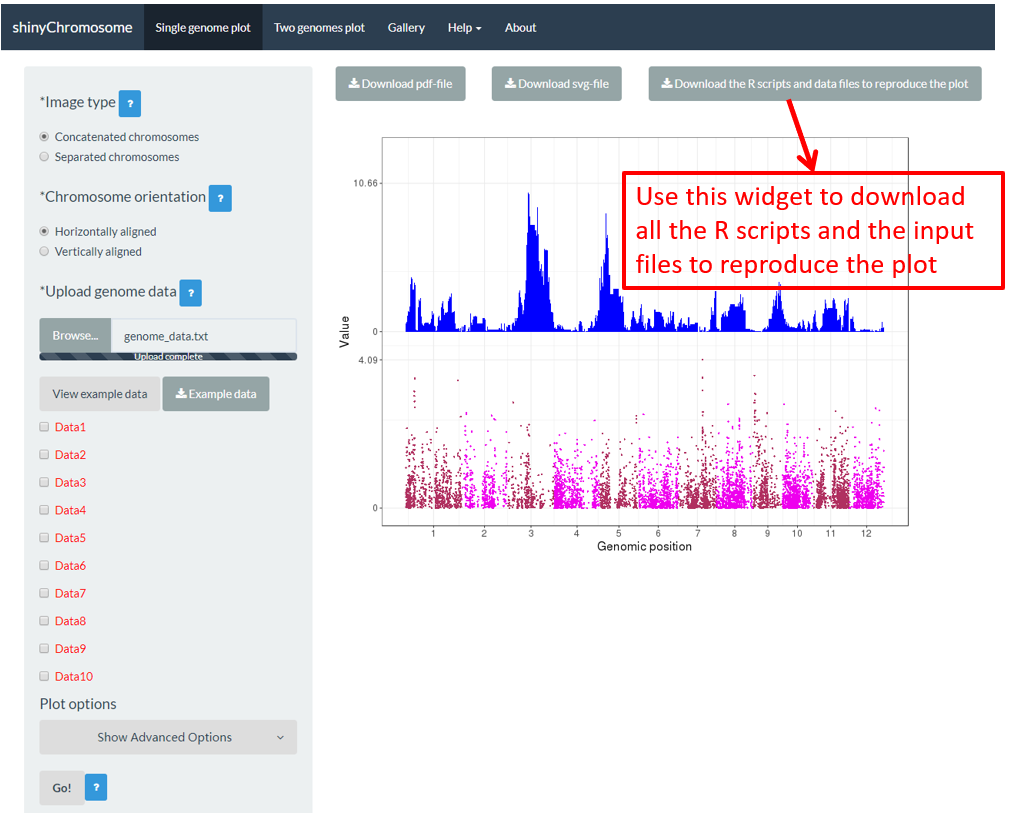
Figure 16. The widget to download the R scripts and user-uploaded input files to reproduce the plot.
To use the scripts_data_1.zip file, unzip this file to a directory, for example E:/ . Then open the R environment using RStudio. The R script Script_1.R is the main R script that would be used in RStudio to reproduce the plot. The path of the Script_1.R script in the disk is usually not the same as the default working directory of RStudio. We need to set them as the same directory. Here, we set the working directory of RStudio as E:/ by editing the Script_1.R script in RStudio as the R scripts and user-uploaded input datasets were unzip to the directory E:/ (Figure 17). Finally, run all the code in the edited Script_1.R script and a PDF file named Visualization_1.pdf would be generated in the directory E:/ . The content of the Visualization_1.pdf is the same as the plot generated using the graphical interface of shinyChromosome in Figure 16.

Figure 17. Open and edit the Script_1.R script as indicated in red box. Then run all the code of the edited Script_1.R script in RStudio to reproduce the single-genome plot.
4.6 Create different types of single-genome plot using shinyChromosome
A total of 12 different types of plot can be created using shinyChromosome, including point, line, bar, rect_gradual, rect_discrete, heatmap_gradual, heatmap_discrete, text, segment, vertical_line, horizontal_line and ideogram. To create a single-genome plot, at least two input data files are needed, the genome data file which defines the genome used in the plot and other datasets to be displayed along all chromosomes of the genome. The format of genome data is illustrated in section 4.1. The detailed format of input files to make different types of single-genome plot is demonstrated in the Input data format menu (under the Help menu) of the shinyChromosome application. In this section, we will show the key parameters to make different types of single-genome plot using the graphical interface of shinyChromosome with example input datasets. The example genome data files used in this section is the same as the file used in section 4.1 (https://github.com/venyao/shinyChromosome/blob/master/www/data/download_example_data/single_genome/genome_data.txt).
4.6.1 Plot point
To make point plot using shinyChromosome, we need two input files, the genome data file and the input file defining the genomic position and the value of each point. The simplest dataset to plot point should contain 3 columns including the chromosome IDs, genomic positions and numeric values. Each genomic position would be represented as a point along the defined genome. Here, we use the example files genome_data.txt (https://github.com/venyao/shinyChromosome/blob/master/www/data/download_example_data/single_genome/genome_data.txt) and point.txt (https://github.com/venyao/shinyChromosome/blob/master/www/data/download_example_data/single_genome/point.txt) provided in the source code of shinyChromosome to demonstrate the procedure to plot point using shinyChromosome (Figure 18).

Figure 18. The procedure to plot point using shinyChromosome.
4.6.2 Plot line
To make line plot using shinyChromosome, we need two input files, the genome data file and the input file defining the position and the value of each point to be connected in a line. The simplest dataset to plot line should contain 3 columns including the chromosome IDs, genomic positions and numeric values. Here, we use the example files genome_data.txt (https://github.com/venyao/shinyChromosome/blob/master/www/data/download_example_data/single_genome/genome_data.txt) and line.txt (https://github.com/venyao/shinyChromosome/blob/master/www/data/download_example_data/single_genome/line.txt) provided in the source code of shinyChromosome to demonstrate the procedure to plot line using shinyChromosome (Figure 19).

Figure 19. The procedure to plot line using shinyChromosome.
4.6.3 Plot bar
To make bar plot using shinyChromosome, we need two input files, the genome data file and the input file defining the position and the value of each genomic region to be displayed as a bar. The simplest dataset to plot bar should contain 4 columns including the chromosome IDs, start coordinates of genomic regions, end coordinates of genomic regions and the heights of different bars. Here, we use the example files genome_data.txt (https://github.com/venyao/shinyChromosome/blob/master/www/data/download_example_data/single_genome/genome_data.txt) and bar.txt (https://github.com/venyao/shinyChromosome/blob/master/www/data/download_example_data/single_genome/bar.txt) provided in the source code of shinyChromosome to demonstrate the procedure to plot bar using shinyChromosome (Figure 20).

Figure 20. The procedure to plot bar using shinyChromosome.
4.6.4 Plot rect_gradual
To make gradual rectangle plot using shinyChromosome, we need two input files, the genome data file and the input file defining the position and the value of each genomic region to be displayed as a rectangle. The simplest dataset to plot gradual rectangle should contain 4 columns including the chromosome IDs, start coordinates of genomic regions, end coordinates of genomic regions and the value of each rectangle. The 4th column should be a numeric vector representing continuous variables. Here, we use the example files genome_data.txt (https://github.com/venyao/shinyChromosome/blob/master/www/data/download_example_data/single_genome/genome_data.txt) and rect_gradual.txt (https://github.com/venyao/shinyChromosome/blob/master/www/data/download_example_data/single_genome/rect_gradual.txt) provided in the source code of shinyChromosome to demonstrate the procedure to plot rect_gradual using shinyChromosome (Figure 21). Please be noted that the Image type is set as Separated chromosomes to split the 12 chromosomes.

Figure 21. The procedure to plot rect_gradual using shinyChromosome.
4.6.5 Plot rect_discrete
To make discrete rectangle plot using shinyChromosome, we need two input files, the genome data file and the input file defining the position and the value of each genomic region to be displayed as a rectangle. The simplest dataset to plot discrete rectangle should contain 4 columns including the chromosome IDs, start coordinates of genomic regions, end coordinates of genomic regions and the value of each rectangle. The 4th column should be a character vector representing discrete variables. Here, we use the example files genome_data.txt (https://github.com/venyao/shinyChromosome/blob/master/www/data/download_example_data/single_genome/genome_data.txt) and rect_discrete.txt (https://github.com/venyao/shinyChromosome/blob/master/www/data/download_example_data/single_genome/rect_discrete.txt) provided in the source code of shinyChromosome to demonstrate the procedure to plot rect_discrete using shinyChromosome (Figure 22). Please be noted that the Image type is set as Separated chromosomes to split the 12 chromosomes of the rice genome.

Figure 22. The procedure to plot rect_discrete using shinyChromosome.
4.6.6 Plot heatmap_gradual
To make gradual heatmap using shinyChromosome, we need two input files, the genome data file and the input file defining the position and the values of each genomic region to be displayed as a cell of a heatmap. The simplest dataset to plot gradual heatmap should contain at least4 columns.
-
The 1-3 columns of data for heatmap_gradual plot are the chromosome IDs, start coordinates of genomic regions and end coordinates of genomic regions.
-
Apart from the first three columns, other columns should be numeric vectors representing continuous variables.
Here, we use the example files genome_data.txt (https://github.com/venyao/shinyChromosome/blob/master/www/data/download_example_data/single_genome/genome_data.txt) and heatmap_gradual.txt (https://github.com/venyao/shinyChromosome/blob/master/www/data/download_example_data/single_genome/heatmap_gradual.txt) provided in the source code of shinyChromosome to demonstrate the procedure to plot heatmap_gradual using shinyChromosome (Figure 23). Please be noted that the Image type is set as Separated chromosomes to split the 12 chromosomes of the rice genome.

Figure 23. The procedure to plot heatmap_gradual using shinyChromosome.
4.6.7 Plot heatmap_discrete
To make discrete heatmap using shinyChromosome, we need two input files, the genome data file and the input file defining the position and the values of each genomic region to be displayed as a cell of a heatmap. The simplest dataset to plot discrete heatmap should contain at least4 columns.
-
The 1-3 columns of data for heatmap_gradual plot are the chromosome IDs, start coordinates of genomic regions and end coordinates of genomic regions.
-
Apart from the first three columns, other columns should be character vectors representing different categories.
Here, we use the example files genome_data.txt (https://github.com/venyao/shinyChromosome/blob/master/www/data/download_example_data/single_genome/genome_data.txt) and heatmap_discrete.txt (https://github.com/venyao/shinyChromosome/blob/master/www/data/download_example_data/single_genome/heatmap_discrete.txt) provided in the source code of shinyChromosome to demonstrate the procedure to plot heatmap_discrete using shinyChromosome (Figure 24). Please be noted that the Image type is set as Separated chromosomes to split the 12 chromosomes of the rice genome.

Figure 24. The procedure to plot heatmap_discrete using shinyChromosome.
4.6.8 Plot text
To plot text using shinyChromosome, we need two input files, the genome data file and the input file defining the position of the text to be displayed along the genome. The simplest dataset to plot text should contain 4 columns.
-
The 1-3 columns of data for text plot are the chromosome IDs, X-axis coordinates and the Y-axis coordinates of texts.
-
The last column should be a character vector representing texts.
Here, we use the example files genome_data.txt (https://github.com/venyao/shinyChromosome/blob/master/www/data/download_example_data/single_genome/genome_data.txt) and text.txt (https://github.com/venyao/shinyChromosome/blob/master/www/data/download_example_data/single_genome/text.txt) provided in the source code of shinyChromosome to demonstrate the procedure to plot text using shinyChromosome (Figure 25). Please be noted that some of the advanced options has been modified as is shown in Figure 25. Please be noted that the Image type is set as Separated chromosomes to split the 12 chromosomes of the rice genome.

Figure 25. The procedure to plot text using shinyChromosome.
4.6.9 Plot segment
To plot segment using shinyChromosome, we need two input files, the genome data file and the input file defining the start and end positions of the segment to be displayed along the genome. The simplest dataset to plot segment should contain 5 columns.
-
The 1st column contains the chromosome IDs of each segment.
-
Columns 2-3 and columns 4-5 represent the positions of the two ends of segment respectively.
Here, we use the example files genome_data.txt (https://github.com/venyao/shinyChromosome/blob/master/www/data/download_example_data/single_genome/genome_data.txt) and segment.txt (https://github.com/venyao/shinyChromosome/blob/master/www/data/download_example_data/single_genome/segment.txt) provided in the source code of shinyChromosome to demonstrate the procedure to plot segment using shinyChromosome (Figure 26).
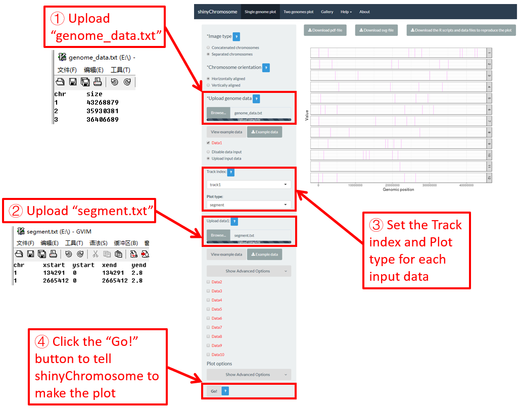
Figure 26. The procedure to plot segment using shinyChromosome.
4.6.10 Plot vertical_line
Vertical lines are usually mixed with other types of plot. The input data to create vertical lines should include two columns. The first column is the chromosome IDs and the second column is the X-axis coordinate of each vertical line.
Here, we use the example files genome_data.txt (https://github.com/venyao/shinyChromosome/blob/master/www/data/download_example_data/single_genome/genome_data.txt), vertical_line.txt (https://github.com/venyao/shinyChromosome/blob/master/www/data/download_example_data/single_genome/vertical_line.txt) and bar.txt (https://github.com/venyao/shinyChromosome/blob/master/www/data/download_example_data/single_genome/bar.txt) provided in the source code of shinyChromosome to demonstrate the procedure to plot vertical line using shinyChromosome (Figure 27).
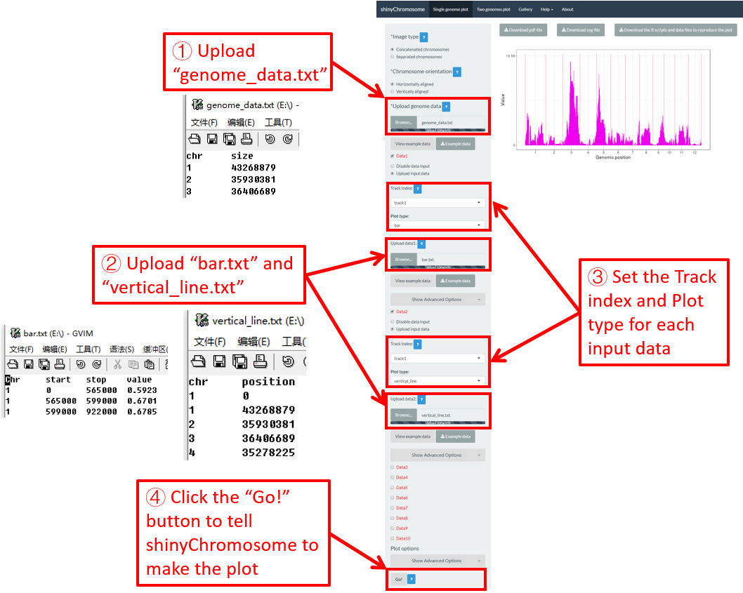
Figure 27. The procedure to plot vertical_line using shinyChromosome.
4.6.11 Plot horizontal_line
Horizontal lines are usually mixed with other types of plot. The input data to create horizontal lines should include one column representing the Y-axis coordinate of each horizontal line.
Here, we use the example files genome_data.txt (https://github.com/venyao/shinyChromosome/blob/master/www/data/download_example_data/single_genome/genome_data.txt), horizontal_line.txt (https://github.com/venyao/shinyChromosome/blob/master/www/data/download_example_data/single_genome/horizontal_line.txt) and bar.txt (https://github.com/venyao/shinyChromosome/blob/master/www/data/download_example_data/single_genome/bar.txt) provided in the source code of shinyChromosome to demonstrate the procedure to plot horizontal line using shinyChromosome (Figure 28).

Figure 28. The procedure to plot horizontal_line using shinyChromosome.
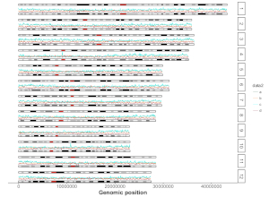
4.6.12 Plot ideogram
Ideogram is a schematic representation of chromosomes. The input data to create ideogram should contain 5 columns. Please check https://www.nature.com/scitable/topicpage/chromosome-mapping-idiograms-302 and http://genome.ucsc.edu/cgi-bin/hgTables?db=hg38&hgta_group=map&hgta_track=cytoBand&hgta_table=cytoBand&hgta_doSchema=describe+table+schema for more information. To plot ideogram using shinyChromosome, we need two input files, the genome data file and the input file to create ideogram.
Here, we use the example files genome_data.txt (https://github.com/venyao/shinyChromosome/blob/master/www/data/download_example_data/single_genome/genome_data.txt) and ideogram.txt (https://github.com/venyao/shinyChromosome/blob/master/www/data/download_example_data/single_genome/ideogram.txt) provided in the source code of shinyChromosome to demonstrate the procedure to plot ideogram using shinyChromosome (Figure 29). Please be noted that the Image type is set as Separated chromosomes to split the 12 chromosomes of the rice genome.
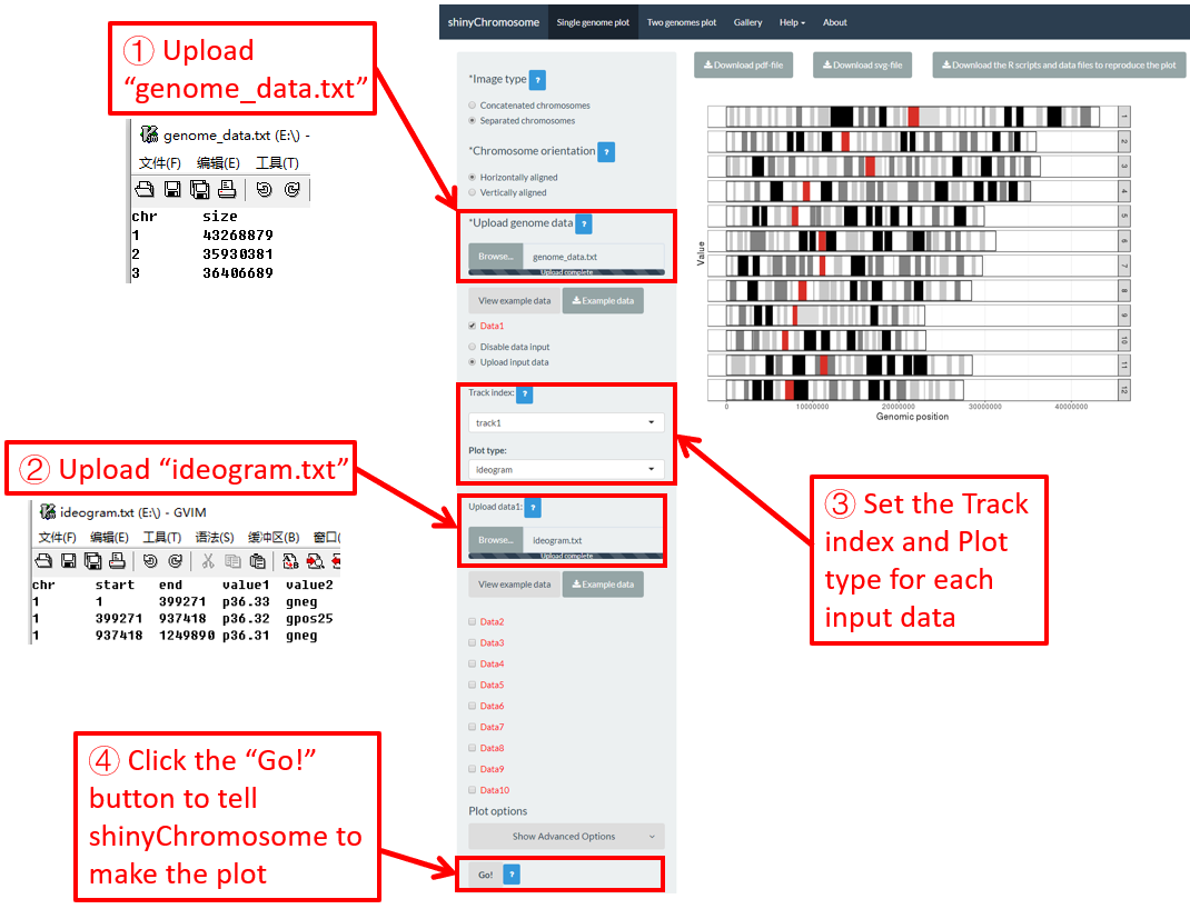
Figure 29. The procedure to plot ideogram using shinyChromosome.
4.7 Integration of multiple input datasets to create advanced single-genome plot using shinyChromosome
In section 4.6, we demonstrated the procedure to create different types of single-genome plot using shinyChromosome. To make things simple, we create a single type of plot in each example at a time in section 4.6. Actually, shinyChromosome accepts as many as 10 input datasets to create a single-genome plot. Each input dataset can be used to create any of the 12 different types of plot. Here, we use the example dataset Example 1 provided in the Gallery menu of shinyChromosome to demonstrate the procedure to create advanced single-genome plot using shinyChromosome (Figure 30).

Figure 30. The procedure to create advanced single-genome plot with multiple input datasets using shinyChromosome.
A total of 6 input datasets are distributed in 5 tracks of the generated plot. The uploading of the 6 input datasets and the setting of the track index and plot type for each dataset are shown in Figure 30. Except for the procedure demonstrated in Figure 30, other options were tunned to create the plot, including the display of figure legends, setting of figure theme and the size of each track. Setting of these options are shown in Figure 31.
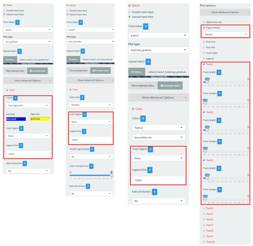
Figure 31. Settings of various options to decorate the plot created in Figure 30 using shinyChromosome.
4.8 Plotting options to decorate a single-genome plot
Various widgets are provided in the left panel of the Single-genome plot menu under each DataX checkbox to decorate the appearance of the generated single-genome plot. The following section will demonstrate the setting of some of these options.
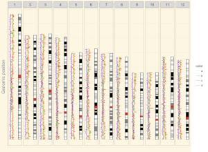
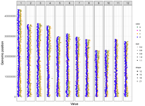
4.8.1 Concatenated chromosomes v.s. Separated chromosomes
All the chromosomes in a single-genome plot can either be concatenated in sequential order or can be separated in different panels by setting the Image type widget at the top of the left panel of the Single-genome plot menu. The input datasets are the same for Example 10 and Example 12 displayed in the Gallery menu of the shinyChromosome application. All the chromosomes are concatenated in sequential order in the plot shown in Example 10 while all the chromosomes are separated in different panels in the plot shown in Example 12 . The procedure and the setting of options to create the plot in Example 10 and Example 12 are demonstrated in Figure 32 and Figure 33, respectively.
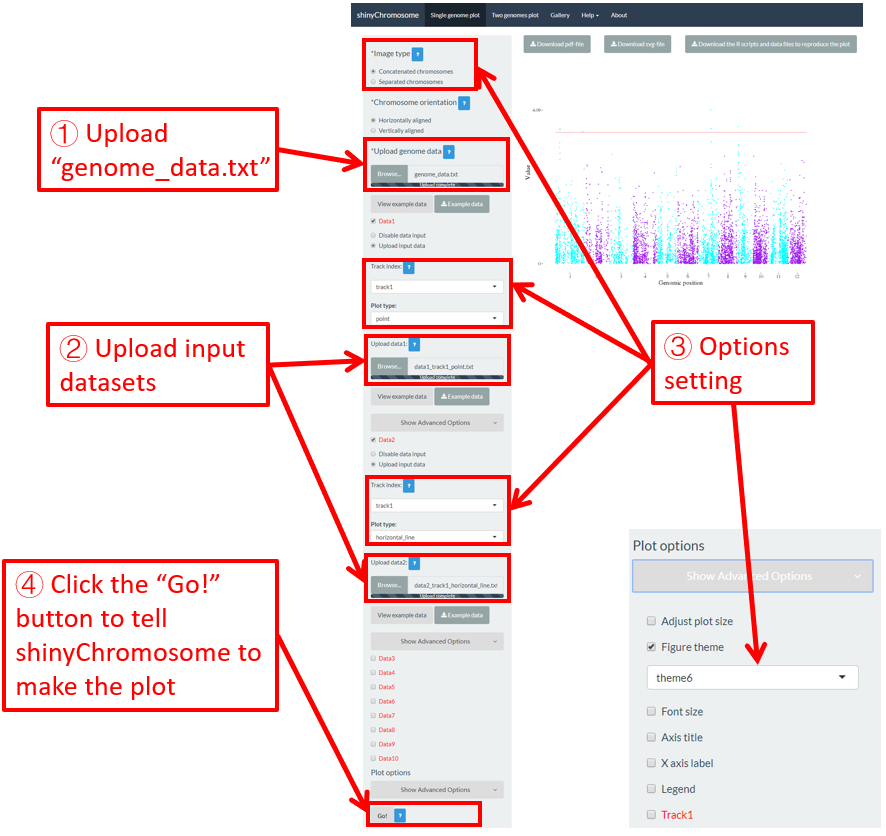
Figure 32. A single-genome plot with concatenated chromosomes created using the input dataset of Example 10 in the Gallery menu.
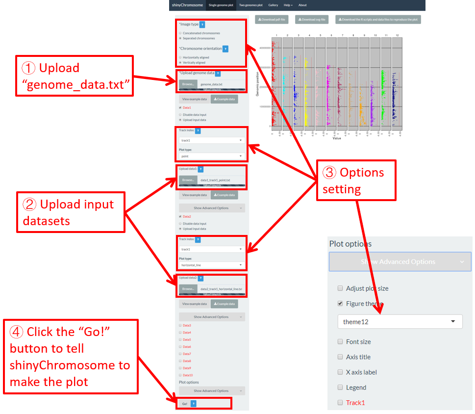
Figure 33. A single-genome plot with separated chromosomes created using the input dataset of Example 12 in the Gallery menu.
4.8.2 Horizontally aligned chromosomes v.s. vertically aligned chromosomes
All the chromosomes in a single-genome plot can either be aligned along the horizontal axis or be aligned along the vertical axis by setting the Chromosome orientation widget at the top of the left panel of the Single-genome plot menu. The input datasets are the same for Example 10 and Example 12 displayed in the Gallery menu of the shinyChromosome application. All the chromosomes are aligned along the horizontal axis in the plot shown in Example 10 while all the chromosomes are aligned along the vertical axis in the plot shown in Example 12 . The procedure and the setting of options to create the plot in Example 10 and Example 12 are demonstrated in Figure 32 and Figure 33, respectively.
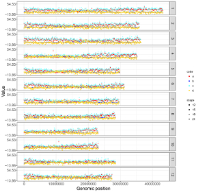
4.8.3 Set point color, point size and point symbol
For a point plot, we can modify the point color, point size and point symbol using the widgets provided in the left panel of the Single-genome plot menu. Here, we use the input datasets of Example 17 displayed in the Gallery menu to demonstrate these widgets.
By default, random color and predefined size and symbol would be assigned to the points as is shown in Figure 34. If we want to change the point color, point size or point symbol, we can edit the default values of these widgets under the Color , Symbol and Size checkbox, as is shown in Figure 35.

Figure 34. Default settings of point color, point shape and point size in shinyChromosome.
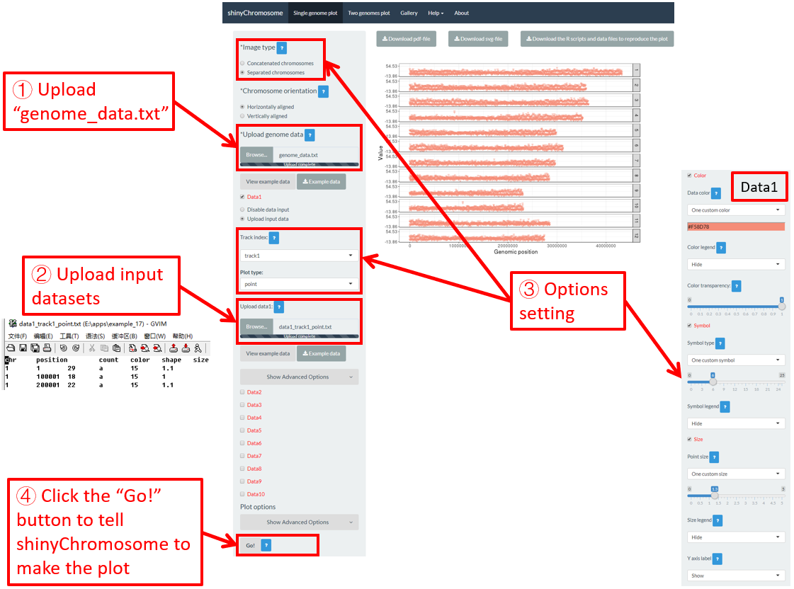
Figure 35. Settings of point color, point shape and point size using different widgets in shinyChromosome.
Actually, the input dataset of Example 17 contains a color column, a shape column and a size column to assign the color, symbol and the size of the points. To set the point color, point size and point symbol using the color column, the shape column and the size column inside the input dataset, we need to set the values of widgets under the Color , Symbol and Size checkbox, as is shown in Figure 36.

Figure 36. Settings of point color, point shape and point size using the color , symbol and size columns of input dataset in shinyChromosome.
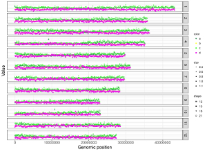
4.8.4 Set rect color for multiple datasets
For a rect_discrete plot, we can set the color of rectangles belonging to different groups using the widgets provided in the left panel of the Single-genome plot menu. Here, we use the input datasets of Example 37 displayed in the Gallery menu to demonstrate these widgets. Three input datasets are uploaded to make rect_discrete plot. The fourth column of each dataset is a color column to define the group of each genomic region, which will be assigned different colors. By default, random colors would be assigned as is shown in Figure 37. If we want to set the colors of different data group, we can use the color widget of each dataset. The procedure is shown in Figure 38, including the settings of various options.

Figure 37. Default settings of rect colors in shinyChromosome.

Figure 38. Settings of rect colors using the color column of input dataset in shinyChromosome.
Contents
4. Creation of non-circular single-genome plots using shinyChromosome
4.1 Essential steps to create a non-circular single-genome plot
Step 1. Prepare and upload the input file of the genome data
Step 2. Upload other input datasets to be displayed along all chromosomes of the input genome
Step 3. Set track index and plot type for each input dataset
Step 4. Click the “Go!” button to make the plot
4.2 Turn off an input dataset used to make a single-genome plot
4.3 Replace an input dataset used to make a single-genome plot
4.4 Download the created single-genome plot in PDF or SVG format
4.5 Download the R scripts and user-uploaded input datasets to reproduce the single-genome plot
4.6 Create different types of single-genome plot using shinyChromosome
4.6.1 Plot point
4.6.2 Plot line
4.6.3 Plot bar
4.6.4 Plot rect_gradual
4.6.5 Plot rect_discrete
4.6.6 Plot heatmap_gradual
4.6.7 Plot heatmap_discrete
4.6.8 Plot text
4.6.9 Plot segment
4.6.10 Plot vertical_line
4.6.11 Plot horizontal_line
4.6.12 Plot ideogram
4.7 Integration of multiple input datasets to create advanced single-genome plot using shinyChromosome
4.8 Plotting options to decorate a single-genome plot
4.8.1 Concatenated chromosomes v.s. Separated chromosomes
4.8.2 Horizontally aligned chromosomes v.s. vertically aligned chromosomes
4.8.3 Set point color, point size and point symbol
4.8.4 Set rect color for multiple datasets
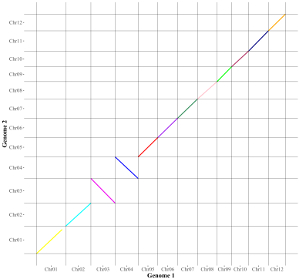
5. Creation of Non-circular two-genome plot using shinyChromosome
To create a non-circular two-genome plot, you need to use the “Two-genome plot” menu of the shinyChromosome application. Three datasets are required to create a two-genome plot.The first dataset defines the genome aligned along the horizontal axis. The second dataset defines the genome aligned along the vertical axis. The third dataset is the main dataset used to create the two-genome plot. In the following section, we demonstrate all the essential steps to create a non-circular two-genome plot using shinyChromosome with example datasets.
5.1 Essential steps to create a non-circular two-genome plot
Step 1. Prepare and upload the input file of the genome data aligned along the horizontal axis
The format of the genome data is the same as the genome data illustrated in section 4.1. An example dataset is available at https://github.com/venyao/shinyChromosome/blob/master/www/data/download_example_data/two_genome/genome1_data.txt. This example dataset is used to create the plot in Figure 39. This input file should be uploaded using the “Upload genome1 data” widget in the left panel of the “Two-genome plot” menu.
Step 2. Prepare and upload the input file of the genome data aligned along the vertical axis
The format of the genome data is the same as the genome data illustrated in section 4.1. An example dataset is available at https://github.com/venyao/shinyChromosome/blob/master/www/data/download_example_data/two_genome/genome2_data.txt. This example dataset is used to create the plot in Figure 39. The input files used in Step 1 and Step 2 can either be the same file or different files. This input file should be uploaded using the “Upload genome2 data” widget in the left panel of the “Two-genome plot” menu.
Step 3. Prepare and upload the main dataset
The detailed file format of the main dataset used to create a “Two-genome plot” is described in the “Input data format” menu of the shinyChromosome application. Here, we use the example dataset “point_gradual.txt” (https://github.com/venyao/shinyChromosome/blob/master/www/data/download_example_data/two_genome/point_gradual.txt) to create the plot in Figure 39.
Step 4. Set the plot type for the main dataset
Here, the plot type is set as “point_gradual” (Figure 39).
Step 5. Click the “Go!” button to make the plot
After all the input datasets has been successfully uploaded to the shinyChromosome application, we need to click the “Go!” button at the bottom of the left panel of the “Two-genome plot” menu to tell shinyChromosome to make the plot (Figure 39). The plot shown in the main panel of Figure 39 is the plot generated using the input datasets uploaded in Step 1, Step 2 and Step 3. By default, random color or predefined colors would be used by shinyChromosome when generating the plot. Remember to click the “Go!” button to update the plot whenever you modify any option or input file through the diverse widgets provided in the left panel.
Figure 39. Essential steps to create a two-genome plot using shinyChromosome.
5.2 Create different types of two-genome plot using shinyChromosome
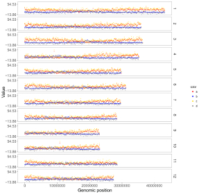
A total of 5 different types of plot can be created using shinyChromosome, including point_gradual, point_discrete, segment, rect_gradual and rect_discrete. To create a two-genome plot, at least three input data files are needed. The detailed format of input files to make a two-genome plot is demonstrated in the “Input data format” menu (under the “Help” menu) of the shinyChromosome application. In this section, we will show the key parameters to make different types of two-genome plot using the graphical interface of shinyChromosome with example input datasets. The two example genome data files used in this section is the same as the file used in section 5.1 (https://github.com/venyao/shinyChromosome/blob/master/www/data/download_example_data/two_genome/genome1_data.txt, https://github.com/venyao/shinyChromosome/blob/master/www/data/download_example_data/two_genome/genome2_data.txt).
5.2.1 Plot point_gradual
The input dataset should contain 5 columns.
1st column: chromosome ID of genome along the horizontal axis.
2nd column: chromosome position in genome along the horizontal axis.
3rd column: chromosome ID of genome along the vertical axis.
4th column: chromosome position in genome along the vertical axis.
5th column: a numeric vector defining the value of each point.
The procedure to plot point_gradual using shinyChromosome is demonstrated in Figure 39.
5.2.2 Plot point_discrete
The input dataset should contain 5 columns.
1st column: chromosome ID of genome along the horizontal axis.
2nd column: chromosome position in genome along the horizontal axis.
3rd column: chromosome ID of genome along the horizontal axis.
4th column: chromosome position in genome along the vertical axis.
5th column: a character vector defining the category of each point.
Here, we use the example dataset “point_discrete.txt” (https://github.com/venyao/shinyChromosome/blob/master/www/data/download_example_data/two_genome/point_discrete.txt) provided in the source code of the shinyChromosome application. The procedure to plot point_discrete using shinyChromosome is demonstrated in Figure 40.

Figure 40. The procedure to plot point_discrete using shinyChromosome.
5.2.3 Plot segment
The dataset should contain >=6 columns. In the simplest situation, the dataset should contain 6 columns with fixed order.
1st column: chromosome ID of genome along the horizontal axis.
2nd column: X-axis start coordinate of segments.
3rd column: X-axis end coordinate of segments.
4th column: chromosome ID of genome along the vertical axis.
5th column: Y-axis start coordinate of segments.
6th column: Y-axis end coordinate of segments.
Here, we use the example dataset “segment.txt” (https://github.com/venyao/shinyChromosome/blob/master/www/data/download_example_data/two_genome/segment.txt) provided in the source code of the shinyChromosome application. The procedure to plot segment using shinyChromosome is demonstrated in Figure 41.
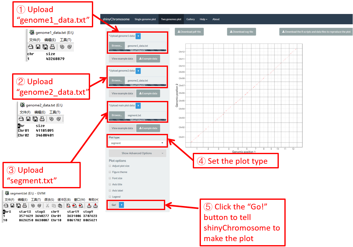
Figure 41. The procedure to plot segment using shinyChromosome.
5.2.4 Plot rect_gradual
The dataset should contain 7 columns with fixed order.
1st column: chromosome ID of genome along the horizontal axis.
2nd column: X-axis start coordinate of rects.
3rd column: X-axis end coordinate of rects.
4th column: chromosome ID of genome along the vertical axis.
5th column: Y-axis start coordinate of rects.
6th column: Y-axis end coordinate of rects.
7th column: a numeric vector defining the value of each rectangle.
Here, we use the example dataset “rect_gradual.txt” (https://github.com/venyao/shinyChromosome/blob/master/www/data/download_example_data/two_genome/rect_gradual.txt) provided in the source code of the shinyChromosome application. The procedure to plot rect_gradual using shinyChromosome is demonstrated in Figure 42.

Figure 42. The procedure to plot rect_gradual using shinyChromosome.
5.2.5 Plot rect_discrete
The dataset should contain 7 columns with fixed order.
1st column: chromosome ID of genome along the horizontal axis.
2nd column: X-axis start coordinate of rects.
3rd column: X-axis end coordinate of rects.
4th column: chromosome ID of genome along the vertical axis.
5th column: Y-axis start coordinate of rects.
6th column: Y-axis end coordinate of rects.
7th column: a character vector defining the category of each rectangle.
Here, we use the example dataset “rect_discrete.txt” (https://github.com/venyao/shinyChromosome/blob/master/www/data/download_example_data/two_genome/rect_discrete.txt) provided in the source code of the shinyChromosome application. The procedure to plot rect_discrete using shinyChromosome is demonstrated in Figure 43.
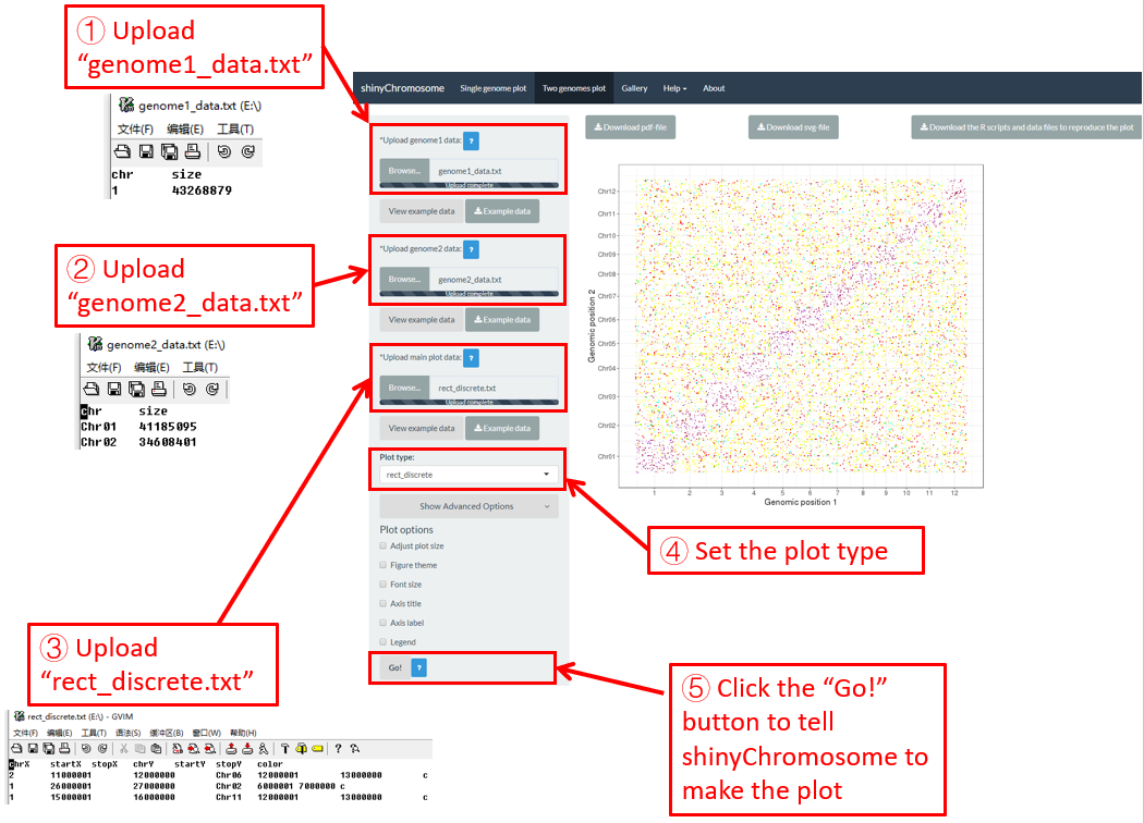
Figure 43. The procedure to plot rect_discrete using shinyChromosome.
Contents
5. Creation of Non-circular two-genome plot using shinyChromosome
5.1 Essential steps to create a non-circular two-genome plot
Step 1. Prepare and upload the input file of the genome data aligned along the horizontal axis
Step 2. Prepare and upload the input file of the genome data aligned along the vertical axis
Step 3. Prepare and upload the main dataset
Step 4. Set the plot type for the main dataset
Step 5. Click the “Go!” button to make the plot
5.2 Create different types of two-genome plot using shinyChromosome
5.2.1 Plot point_gradual
5.2.2 Plot point_discrete
5.2.3 Plot segment
5.2.4 Plot rect_gradual
5.2.5 Plot rect_discrete
6. Decorate the appearances of non-circular whole genome plot created by shinyChromosome
Many widgets are provided in the left panel of the “Single-genome plot” and “Two-genome plot” menus to decorate the appearances of the plot generated using shinyChromosome, including figure size, figure theme, font size, axis title, axis label and legend, etc.
6.1 Figure size
Users can adjust the height and width of a single-genome plot using the “Adjust plot size” widget under the “Show advanced options” widget on the bottom of the left panel of the “Single-genome plot” menu. The figure size in both the browser and the downloaded PDF/SVG files would be affected. Here, we use the example datasets demonstrated in section 4.6.1 to show this function. The default height and width of a single-genome plot are 550 and 750, which is modified as 250 and 800 in Figure 44. Finally, we need to click the “Go!” button to tell shinyChromosome to update the plot.
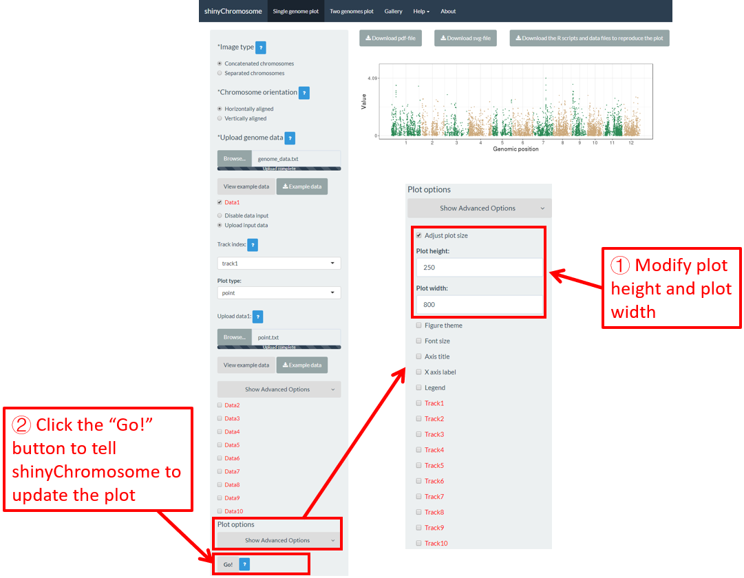
Figure 44. The procedure to modify the height and width of a single-genome plot using shinyChromosome.
6.2 Figure theme
shinyChromosome use the ggplot2 graphics system as the engine to create single-genome plot and two-genome plot. The ggplot2 package provides lots of options to tune the appearances of the plot created using ggplot2. A set of options with predefined values is called a figure theme in ggplot2. This allows changing the overall appearance of a plot generated using ggplot2 with a single command. The ggthemes package is an R package with tens of different themes used to tune the appearance of a plot created using ggplot2. All the themes provided by ggthemes is available at https://yutannihilation.github.io/allYourFigureAreBelongToUs/ggthemes/. The ggthemes package is used in shinyChromosome to decorate the appearance of the single-genome plot and two-genome plot generated using shinyChromosome. Here, we use the example datasets demonstrated in section 4.6.1 to show this function. The default figure theme of a single-genome plot is “theme1” in shinyChromosome, which is modified as “theme18” in Figure 45. Finally, we need to click the “Go!” button to tell shinyChromosome to update the plot.
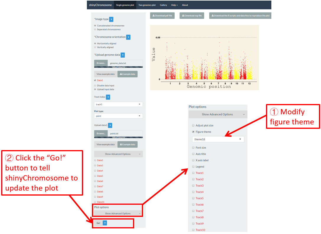
Figure 45. The procedure to modify the theme of a single-genome plot using shinyChromosome.
6.3 Font size
The “Font size” widget on the bottom of the left panel of the “Single-genome plot” and “Two-genome plot” menus can be used to tune the font size of the plot created using shinyChromosome, including the font size of axis titles and axis tick labels. Here, we use the example datasets demonstrated in section 4.6.1 to show this function. The default font size is 16, which is modified as 30 in Figure 46. Finally, we need to click the “Go!” button to tell shinyChromosome to update the plot.
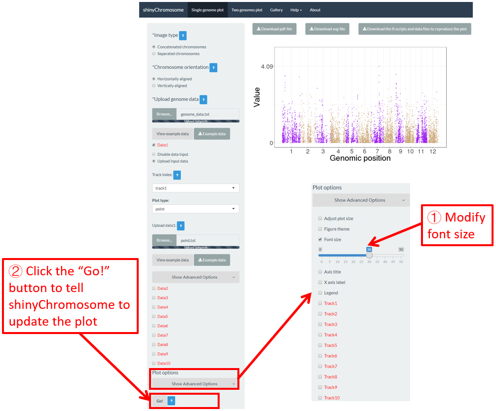
Figure 46. The procedure to modify the font size of a single-genome plot using shinyChromosome.
6.4 Axis title
The “Axis title” widget on the bottom of the left panel of the “Single-genome plot” and “Two-genome plot” menus can be used to tune the axis titles of the plot created using shinyChromosome, including the X-axis title, Y-axis title and the font face of axis titles. Here, we use the example datasets demonstrated in section 4.6.1 to show this function. The default axis titles are modified in Figure 47. Finally, we need to click the “Go!” button to tell shinyChromosome to update the plot.

Figure 47. The procedure to modify the axis titles of a single-genome plot using shinyChromosome.
6.5 Legend
One or more legends can be added to annotate point color, point size, point shape, bar color, heatmap color, etc. By default, no legend would be added to the plot created using shinyChromosome. To add a legend, the users are needed to set the “Advanced options” under the “DataX” checkbox. For example, to add a color legend, we need to set the value of the “Color legend” widget as “Show” in the “Advanced options” of the corresponding “DataX” checkbox (Figure 48).
Legends can be placed at the right or the bottom of a non-circular whole genome plot. A total of 7 widgets are provided at the bottom of the left panel of the “Single-genome plot” menu to tune the appearances of the added legends in the generated plot. The meaning of these widgets is shown as follows.
Legend position: The position to place the legend.
Legend region size: Percent of legend size relative to the main plotting region. Applicable values are numbers in [0-1].
Intra-spacing: Intra-spacing between different legends.
Title font size: The font size of legend title.
Title font face: The font face of legend title.
Label font size: The font size of legend tick label.
Label font face: The font face of legend tick label.
Here, we use the input datasets of “Example 17” displayed in the “Gallery” menu to demonstrate these widgets (Figure 48).

Figure 48. The procedure to add legend to the bottom of a single-genome plot using shinyChromosome.
6.6 Height and width of different tracks
For a single-genome plot, we can modify the height and margin size of each track to tune the size of each track in the generated plot. Here, we use the input datasets in section 4.1 to demonstrate the setting of these options (Figure 49).

Figure 49. The procedure to modify the height and margin size of each track of a single-genome plot using shinyChromosome.
shinyChromosome是一个可交互式创建全基因组非圆形图的R/Shiny应用程序。
1. 在线使用shinyChromosome
在线使用shinyChromosome的网址是 http://venyao.xyz/shinyChromosome/, http://shinychromosome.ncpgr.cn/ 或者 https://yimingyu.shinyapps.io/shinychromosome/。用户可以根据访问速度选择访问这三个网址中的任意一个来使用shinyChromosome。在通过访问网址激活shinyChromosome之前,它是停顿的。因此,第一次访问可能需要一些时间。一旦激活,shinyChromosome就可以被流畅、方便地使用。
2. shinyChromosome的界面
shinyChromosome应用程序包含5个主菜单:“Single-genome plot”,“Two-genome plot”,“Gallery”,“Help”和“关于”(图1)。“About”菜单列出了shinyChromosome应用程序的相关信息,包括基本介绍和shinyChromosome使用到的R包列表。

图1. shinyChromosome应用程序的“About”菜单。
“Single-genome plot”菜单允许用户通过上传输入数据,创建沿着单个基因组的所有染色体排布的非圆形图(图2)。在“Single-genome plot”菜单的左侧是选项面板,其中包含许多小部件来接受用户输入。当上传了合适的数据并正确设置了绘图选项后,可以在主面板的绘图区域中创建并显示基于输入数据构建的图形。主面板绘图区域上方的三个“Download”按钮供用户下载PDF或SVG格式的结果图,以及R脚本和用户上传的输入数据集,以重建该图。
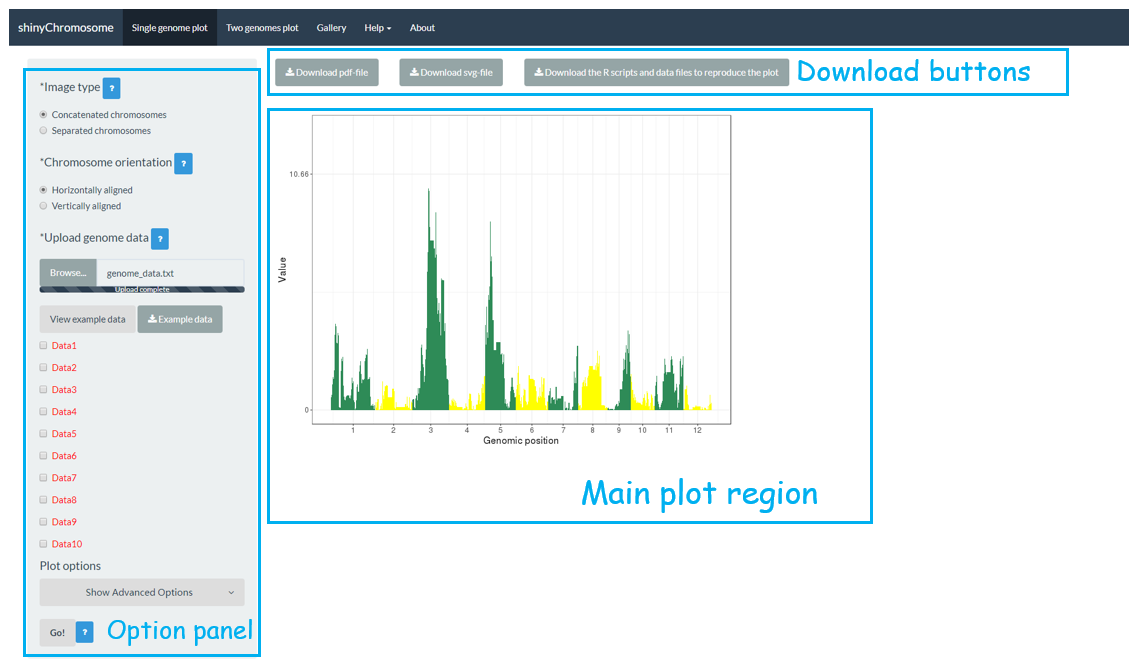
图2. shinyChromosome应用程序的“Single-genome plot”菜单。
“Two-genome plot”菜单允许用户上传输入数据创建基于两个基因组排布的图形,以便在两个基因组之间比较数据(图3)。“Two-genome plot”菜单的左侧面板包含许多小部件,可以接受用户输入。当用户上传了合适的数据并正确设置了绘图选项后,就可以在主绘图区域创建并显示图形。在主绘图区域的顶部提供了三个“Download”按钮,供用户下载结果图,并提供了R脚本供用户在R命令行中重建图形。
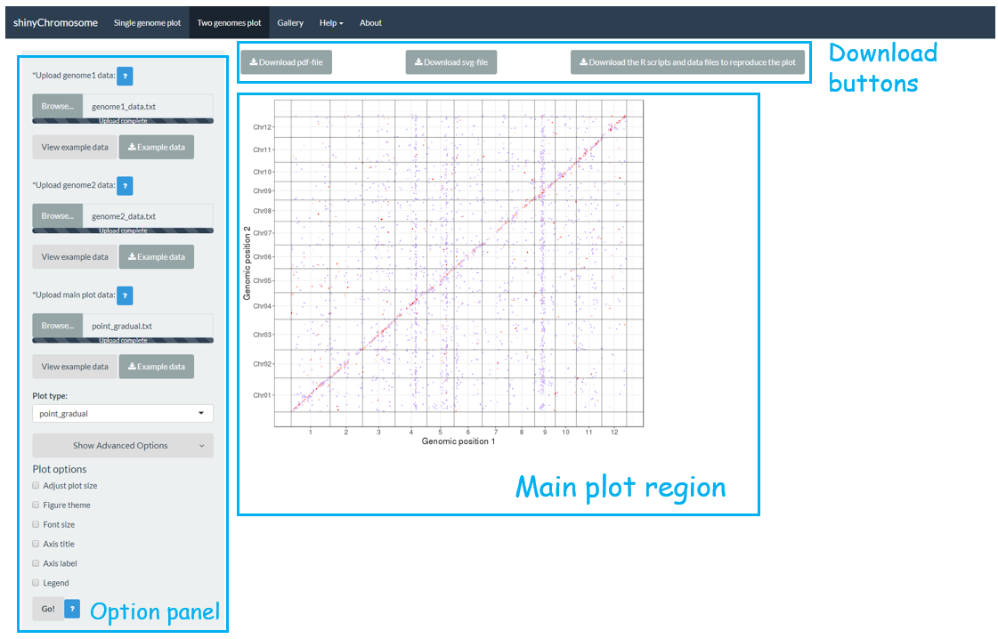
图3. shinyChromosome应用程序的“Two-genome plot”菜单。
在shinyChromosome应用程序的“Gallery”菜单中列出了65个使用shinyChromosome创建的示例图形(图4)。同时提供了用于生成每个示例图的数据集以供下载,其中包含所有输入文件,每个输入文件的被合理命名,指示了数据集中每个文件对应的轨道和绘图类型。

图4. shinyChromosome应用程序的“Gallery”菜单。
shinyChromosome的“Usage and installation”子菜单展示了使用shinyChromosome的不同方式(图5)。

图5. shinyChromosome应用程序的“Usage and installation”子菜单。
“Input data format”子菜单提供了使用shinyChromosome创建不同类型图形的输入数据的详细格式 (图6)。
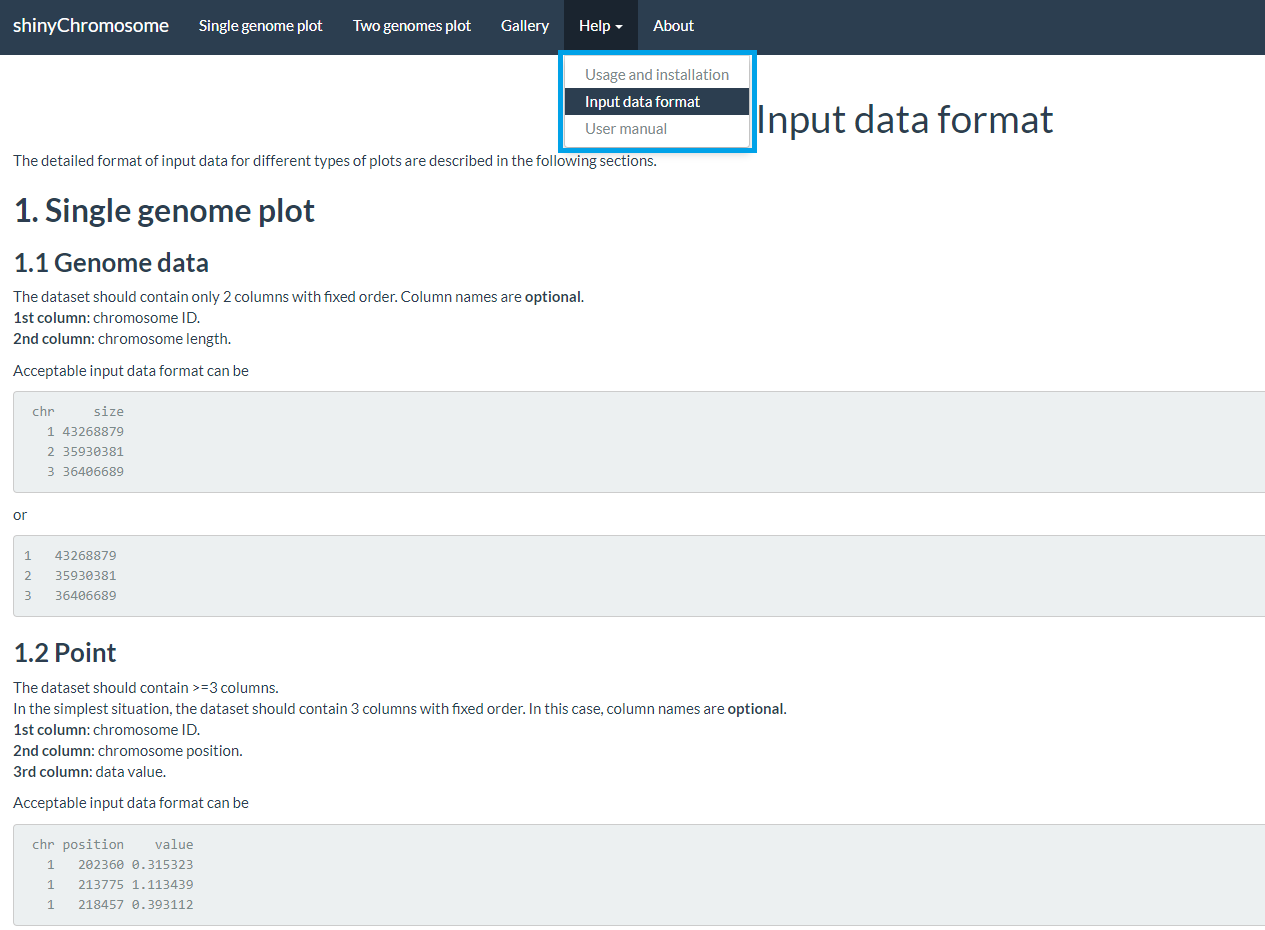
图6. shinyChromosome应用程序的“Input data format”子菜单。
shinyChromosome的“User manual”子菜单提供了本用户手册(英文版)的PDF格式文件(图7)。
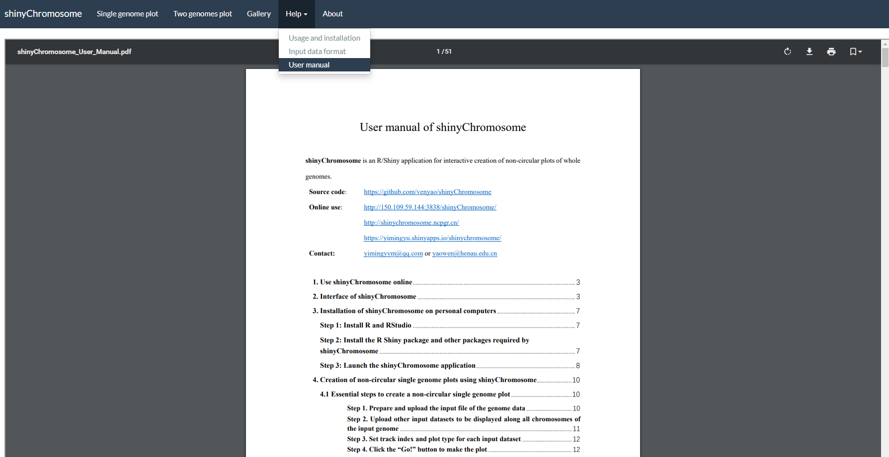
图7. shinyChromosome应用程序的“User manual”子菜单。
3.ShinyChromosome的使用和安装
用户可以选择在个人电脑(Windows、Mac或Linux)上安装和运行shinyChromosome,而无需将数据上传到在线服务器。shinyChromosome是跨平台的应用,即shinyChromosome可以安装在任何具有可用R环境的平台上。shinyChromosome的安装包括三个步骤。
3.1在线使用 shinyChromosome
shinyChromosome 部署在 https://venyao.xyz/shinyChromosome/,
https://venyao.shinyapps.io/shinyChromosome/
和 https://yimingyu.shinyapps.io/shinychromosome/
上以供在线使用。
shinyChromosome 处于空闲状态,直到您通过访问 URL 激活它。
因此,首次访问此 URL 可能需要一些时间。
一旦它被激活,shinyChromosome 就可以顺利、轻松地使用。
3.2直接从 R 和 GitHub 启动 shinyChromosome
用户可以选择运行安装在本地计算机(Windows、Mac 或 Linux)上的 shinyChromosome,以获得更理想的体验。
步骤 1:安装 R 和 RStudio
在运行该应用程序之前,您需要安装 R 和 RStudio(使用 R 3.5.0 和 RStudio 1.1.419 测试)。
请检查 CRAN (https://cran.r-project.org/) 以了解 R 的安装。
请检查 https://www.rstudio.com/ 以了解 RStudio 的安装。
步骤 2:安装 R Shiny 包和 shinyChromosome 需要的其他包
使用 RStudio 启动 R 会话并运行以下行:
# try an http CRAN mirror if https CRAN mirror doesn't work
install.packages("shiny")
install.packages("rlang")
install.packages("zip")
install.packages("ggplot2")
install.packages("plyr")
install.packages("ggthemes")
install.packages("RLumShiny")
install.packages("RColorBrewer")
install.packages("gridExtra")
install.packages("reshape2")
install.packages("data.table")
install.packages("shinythemes")
install.packages("shinyBS")
install.packages("markdown")
# install shinysky
install.packages("devtools")
devtools::install_github("venyao/ShinySky", force=TRUE)
步骤 3:启动应用程序
使用 RStudio 启动 R 会话并运行以下行:
shiny::runGitHub("shinyChromosome", "venyao")
此命令会将 shinyChromosome 的代码从 GitHub 下载到您计算机的临时目录,然后在网络浏览器中启动 shinyChromosome 应用程序。关闭网络浏览器后,下载的 shinyChromosome 代码将从您的计算机中删除。下次在 RStudio 中运行此命令时,它会再次将 shinyChromosome 的源代码从 GitHub 下载到临时目录。这个过程令人沮丧,因为从 GitHub 下载 shinyChromosome 的代码需要一些时间。
建议用户从 GitHub 下载 shinyChromosome 的源代码到你电脑的固定目录下,比如 Windows 上的 E:\apps。按照下图所示的过程,名为“shinyChromosome-master.zip”的 zip 文件将下载到计算机的磁盘上。将此文件移动到 'E:\apps' 并解压缩此文件。然后在 'E:\apps' 中生成一个名为 'shinyChromosome-master' 的目录。脚本 'server.R' 和 'ui.R' 可以在 'E:\apps\shinyChromosome-master' 中找到。
然后,您可以通过在 RStudio 中运行这些行来启动 shinyChromosome 应用程序。
library(shiny)
runApp("E:/apps/shinyChromosome-master", launch.browser = TRUE)
3.3 在本地或 Web Linux 服务器上部署 shinyChromosome
第 1 步:安装 R
请检查 CRAN (https://cran.r-project.org/) 以安装 R。
第 2 步:安装 R Shiny 包和 shinyChromosome 需要的其他包
启动 R 会话并在 R 中运行以下行:
# try an http CRAN mirror if https CRAN mirror doesn't work
install.packages("shiny")
install.packages("rlang")
install.packages("zip")
install.packages("ggplot2")
install.packages("plyr")
install.packages("ggthemes")
install.packages("RLumShiny")
install.packages("RColorBrewer")
install.packages("gridExtra")
install.packages("reshape2")
install.packages("data.table")
install.packages("shinythemes")
install.packages("shinyBS")
install.packages("markdown")
# install shinysky
install.packages("devtools")
devtools::install_github("venyao/ShinySky", force=TRUE)
有关更多信息,请查看以下页面:
https://cran.r-project.org/web/packages/shiny/index.html
https://github.com/rstudio/shiny
https://shiny.rstudio.com/
第 3 步:安装 Shiny-Server
请查看以下页面以安装 shiny-server。
https://www.rstudio.com/products/shiny/download-server/
https://github.com/rstudio/shiny-server/wiki/Building-Shiny-Server-from-Source
第 4 步:上传 shinyChromosome 的文件
将包含 shinyChromosome 代码和数据的目录放到 /srv/shiny-server 中。
第 5 步:配置 shiny 服务器 (/etc/shiny-server/shiny-server.conf)
# Define the user to spawn R Shiny processes
run_as shiny;
# Define a top-level server which will listen on a port
server {
 # Use port 3838
 listen 3838;
 # Define the location available at the base URL
 location /shinychromosome {
 # Directory containing the code and data of shinyChromosome
 app_dir /srv/shiny-server/shinyChromosome;
 # Directory to store the log files
 log_dir /var/log/shiny-server;
 }
}
第 6 步:更改 shinyChromosome 目录的所有者
$ chown -R shiny /srv/shiny-server/shinyChromosome
第 7 步:启动 Shiny-Server
$ start shiny-server
现在,shinyChromosome 应用程序可在 http://IPAddressOfTheServer:3838/shinyChromosome/ 使用。
4. 利用 shinyChromosome 绘制非圆形的单基因组图形
用户可以使用shinyChromosome 应用程序的“Single-genome plot”菜单,来创建非圆形的单基因组图形。制作单个基因组图时,必须输入定义基因组中每条染色体长度的文件,以及1-10个沿基因组排布的输入数据。在本节中,我们将演示使用shinyChromosome 中的示例数据集,创建非圆形单基因组图的所有基本步骤。
4.1 创建非圆形单基因组图形的基本步骤
步骤 1. 准备并上传定义基因组长度的输入文件
基因组数据是必须输入的文件,它定义了非圆形图的框架(示例数据集可在 https://github.com/venyao/shinyChromosome/blob/master/www/data/download_example_data/single_genome/genome_data.txt 中获得)。基因组数据是一个包含两列的文本文件 ( 图 11 )。第一列是染色体编号,第二列是染色体长度。基因组数据的详细格式在shinyChromosome应用程序的 “Input data format” 菜单(在 “Help” 菜单下)中有说明。“Input data format” 菜单中的内容也可以在 GitHub 上找到 ( https://github.com/venyao/shinyChromosome/blob/master/In_Data_Format.md )。
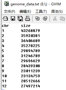
图 11. 定义基因组长度的输入文件的格式。
现在,我们已经准备好了这个文件并将它存储在磁盘上(例如Windows上的“E:/”)。接下来,我们需要通过shinyChromosome应用程序中“Single-genome plot”菜单的左侧面板上“Upload genome data”标志下的“Browse...”小部件,将此文件上传到shinyChromosome应用程序中 ( 图 12 )。
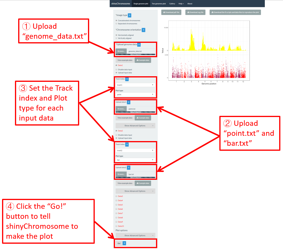
图 12.利用shinyChromosome创建单个基因组图形的基本步骤。文件“genome_data.txt”被上传到基因组 data小部件中。文件“point.txt”上传到“Data1”轨道,而文件“bar.txt”上传到“Data2”轨道。
步骤 2.上传沿着所有染色体排布的其它数据集
用户可以上传1-10个数据集,沿着 步骤 1 中上传的基因组的所有染色体排布。“Single-genome plot”菜单左侧面板上的十个“DataX”(Data1到Data10)复选框就是为了这个目的而提供的( 图 12)。在这里,我们使用两个输入数据集( https://github.com/venyao/shinyChromosome/blob/master/www/data/download_example_data/single_genome/point.txt 和 https://github.com/venyao/shinyChromosome/blob/master/www/data/download_example_data/single_genome/bar.txt ) 来演示这个过程。用来创建不同类型图形的输入文件的详细格式在shinyChromosome应用程序的“Input data format”子菜单中有说明( 图 6 )。首先,我们准备了两个文件并将它们存储在磁盘上(例如,windows上的“E:/”)。要将文件“point.txt”上传到Data1对应的轨道,请选中“Data1”复选框,选择“Upload input data”单选按钮,然后点击“Browse...”小部件从磁盘上传入“point.txt”( 图 12 )。要将文件“bar.txt”上传到Data2对应的轨道,请选中“Data2”复选框,选择“Upload input data”单选按钮,然后点击“Browse...”小部件从磁盘上传入“bar.txt”。
步骤 3.为每个输入数据集设置轨道位置和绘图类型
默认情况下,每个输入数据集的轨道位置为“track1”,每个输入数据集的绘图类型为“point”。因为我们希望使用文件“bar.txt”创建条形图,所以我们需要将文件“bar.txt”对应的轨道位置设置为“track2”,并将输入文件“bar.txt”的绘图类型设置为“bar”( 图 12 )。
步骤 4.点击“ Go!” 按钮绘制图形
所有输入数据集成功上传到shinyChromosome应用程序并正确设置轨道位置和绘图类型后,我们需要单击“Single-genome plot” 菜单左面板底部的“Go!”按钮,告诉shinyChromosome去绘制图形( 图 12 )。图 12 主面板中显示的图是使用步骤1和步骤2中上传的输入数据集生成的图。默认情况下,在绘制图形时, shinyChromosome 将使用随机颜色或者预定义的颜色。
4.2 关闭用于绘制单个基因组图的输入数据集
对于“Single-genome plot”菜单左侧面板上的每个“DataX”复选框,我们提供两个单选按钮选项:“Disable data input”和“Upload input data”。默认情况下, “Disable data input”单选按钮是被选中的。“Upload input data”用于上传输入数据集,而“Disable data input”用于关闭已上传的输入数据集。
在第4.1节中,我们分别将输入文件“point.txt”和“bar.txt”上传到“Data1”和“Data2”。“point.txt”文件用于创建 图 12 中的散点图,而“bar.txt”用于创建 图 12 中的条形图。如果我们想从 图 12 中删除散点图并且只保留条形图,我们可以选中“Data1”复选框下的“Disable data input”单选按钮,然后单击左面板底部的“Go!”按钮,告诉shinyChromosome更新绘图结果。这个过程如 图 13 所示。这样,shinyChromosome就不会使用“point.txt”文件,只会创建条形图, 图 13 所示。当您通过左面板中提供的各种小部件修改任何选项或输入文件时,记得点击“ 走! 按钮来更新绘图结果。

图 13.关闭用于绘制单个基因组图的某个输入数据集的过程
4.3 替换用于绘制单个基因组图的输入数据集
单个基因组图形通常由分布在不同轨道上的几种基本类型的图形组成。每个图形都是使用用户上传的输入数据集创建的。有时,我们可能需要替换其中一个或多个输入文件,这样我们就可以更新单个基因组图形的某些组成部分,而无需重新创建整个图形。例如,我们想用一个新的输入文件“rect_discrete.txt”来替换上传到“Data2”的“bar.txt”来创建离散型矩形图。为了达到这个目的,我们可以使用“Data2”中“Upload input data”单选按钮下的“Browse...”小部件将“rect_discrete.txt”上传到“Data2”。这样,“Data2”中的“bar.txt”将替换为“rect_discrete.txt”。同时,我们需要将“Data2”的绘图类型设置为“rect_discrete”。最后,我们需要点击左面板底部的“Go!”按钮,告诉shinyChromosome更新相应的绘图结果。这个过程如 图 14 所示。
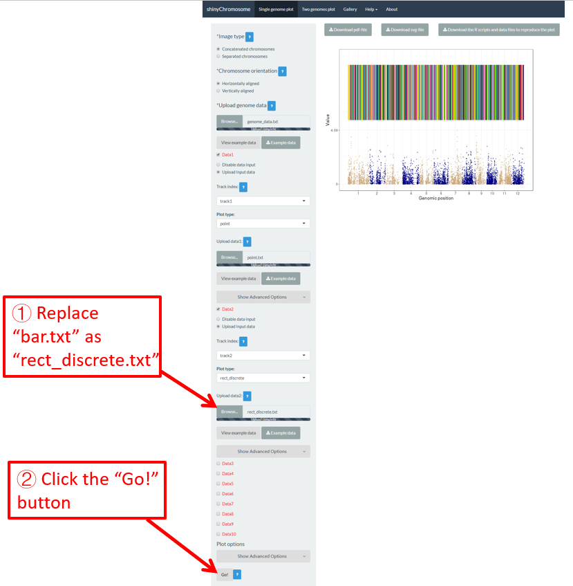
图 14. 替换用于绘制单个基因组图形的某个输入数据集的过程。
4.4 以 PDF 或 SVG 格式下载创建的单个基因组图形
生成单个基因组图形后,用户可以使用“Single-genome plot”菜单主面板上方的小部件“Download PDF-file”和“Download SVG-file”下载PDF或SVG格式的绘图结果( 图 15 )。默认情况下,下载的两个文件分别命名为“Visualization_1.pdf”和“Visualization_1.svg”。

图 15 . 下载的PDF文件“Visualization_1.pdf”可以在Adobe Acrobat中打开,下载的SVG文件“Visualization_1.svg”可以在Google Chrome浏览器中打开。
4.5 下载 R 脚本和用户上传的输入数据集,以重建单个基因组图形
一些用户可能已经注意到,当创建单个基因组图形时,在“Single-genome plot”菜单的主面板中生成的图形顶部提供了一个名为“Download the R scripts and data files to reproduce the plot”的下载小部件 ( 图 16 )。单击此按钮,将会以zip文件形式下载所有用户上传的输入数据集和两个R脚本。默认情况下,下载的zip文件被命名为“scripts_data_1.zip”。下载的R脚本和用户上传的输入数据集可以在shinyChromosome应用程序之外使用,以重建使用shinyChromosome图形界面生成的图形。下载的R脚本应该在R环境中使用。下载的R脚本可以与用户分析流程中的其他脚本一起使用。下载的R脚本可以被循环使用来生成很多类型的图形,只需要修改输入数据文件即可。

图 16 . 下载R脚本和用户上传的输入文件来重建绘图结果的小部件。
要使用“scripts_data_1.zip”文件, 请将该文件解压缩到计算机中的一个目录,例如“E:/”。然后使用RStudio打开R环境。R脚本 “Script_1.R”是在RStudio中用来绘制图形的主要R脚本。磁盘中 “Script_1.R” 脚本的路径通常与RStudio默认的工作目录不同。我们需要将它们设置为相同的目录。在本示例中,因为R脚本和用户上传的输入数据集被解压缩到目录“E:/”中,所以我们通过编辑RStudio中的“Script_1.R”脚本将RStudio的工作目录也设置为“E:/” ( 图 17 )。最后,运行编辑后的“Script_1.R”脚本中的所有代码,在目录“E:/”中将生成一个名为“Visualization_1.pdf”的PDF文件。生成的“Visualization_1.pdf”文件的内容与 图 16 中使用shinyChromosome的图形界面生成的图形是一样的。
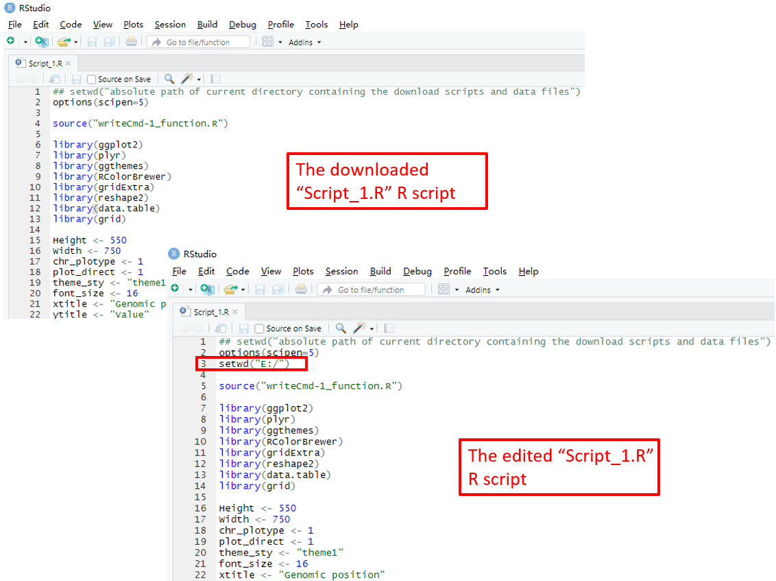
图 17 . 打开并编辑脚本,如红色框中所示。然后在RStudio中运行修改后的“Script_1.R”脚本中的所有代码,以重建单个基因组图形。
4.6 利用 shinyChromosome 绘制不同类型的单基因组图形
使用shinyChromosome可以创建12种不同类型的图形,包括point, line, bar, rect_gradual, rect_discrete, heatmap_gradual, heatmap_discrete, text, segment, vertical_line, horizontal_line 和 ideogram。要创建单个基因组图形,至少需要两个输入数据文件,一个是定义基因组长度的基因组数据文件,另一个是沿基因组显示的染色体数据集。定义基因组长度的文件的格式见第4.1节。在shinyChromosome应用程序的“Input data format”菜单(在“Help”菜单下)中展示了用于绘制不同类型单基因组图形的输入文件的详细格式。在这一节中,我们将展示使用shinyChromosome图形界面和示例输入数据集绘制不同类型单基因组图形的关键参数。本节中使用的定义基因组长度的输入文件与第4.1节中使用的文件是一样的 ( https://github.com/venyao/shinyChromosome/blob/master/www/data/download_example_data/single_genome/genome_data.txt )。
4.6.1 绘制点图
利用shinyChromosome绘制点图需要两个输入文件:基因组数据文件和定义每个点的基因组位置和数值的输入文件。绘制点的最基本数据集应该包含3列:染色体ID、基因组位置和数值。每个基因组的位置用一个点来表示。在这里,我们使用shinyChromosome源代码中提供的示例文件 “genome_data.txt” ( https://github.com/venyao/shinyChromosome/blob/master/www/data/download_example_data/single_genome/genome_data.txt ) 和 “point.txt” ( https://github.com/venyao/shinyChromosome/blob/master/www/data/download_example_data/single_genome/point.txt ) 来演示使用shinyChromosome绘制点图的过程( 图 18 )。
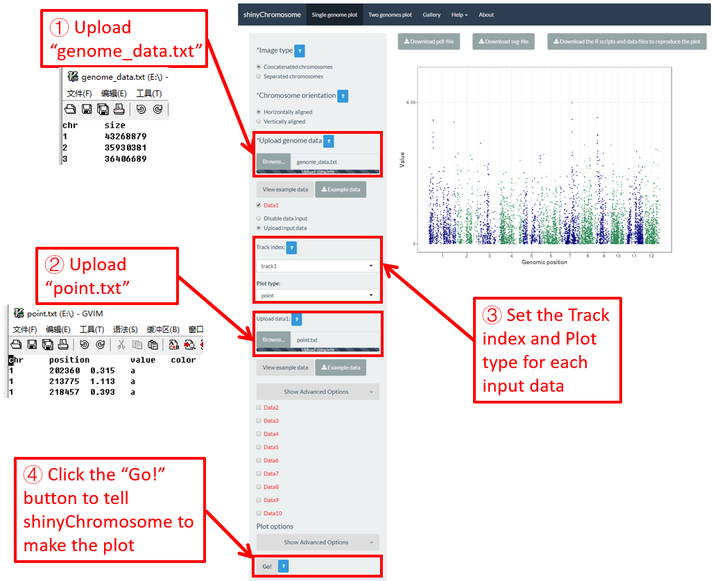
图 18. 使用shinyChromosome绘制点图的过程。
4.6.2 绘制线形图
利用shinyChromosome绘制线性图需要两个输入文件:基因组数据文件和定义每个点的基因组位置和值的输入文件,所有的点连接起来就成了一条线。绘制直线最基本的数据集应包含3列:染色体ID、基因组位置和数值。在这里,我们使用shinyChromosome源代码中提供的示例文件“genome_data.txt” ( https://github.com/venyao/shinyChromosome/blob/master/www/data/download_example_data/single_genome/genome_data.txt ) 和 “line.txt” ( https://github.com/venyao/shinyChromosome/blob/master/www/data/download_example_data/single_genome/line.txt ) 来演示使用shinyChromosome绘制线形图的过程( 图 19 )。
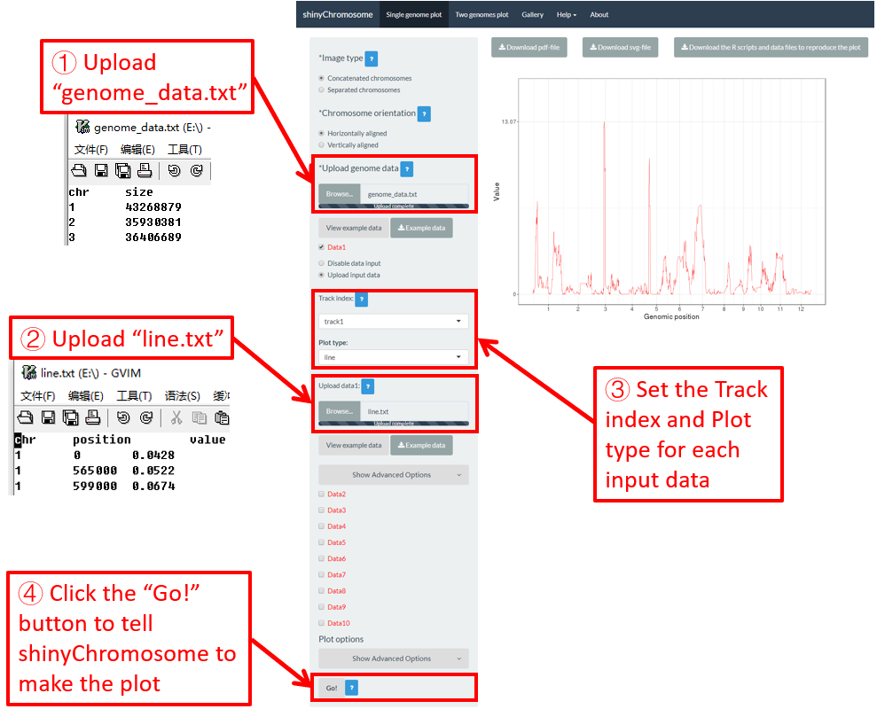
图 19. 使用shinyChromosome绘制线形图的过程。
4.6.3 绘制柱状图
利用shinyChromosome绘制柱状图需要两个输入文件:基因组数据文件和定义每个基因组区间的位置和值的输入文件。绘制柱状图最基本的数据集应该包含4列:染色体ID、基因组区间的起始坐标、基因组区间的结束坐标和不同柱子的高度。在这里,我们使用shinyChromosome源代码中提供的示例文件“genome_data.txt” ( https://github.com/venyao/shinyChromosome/blob/master/www/data/download_example_data/single_genome/genome_data.txt ) 和 “bar.txt” ( https://github.com/venyao/shinyChromosome/blob/master/www/data/download_example_data/single_genome/bar.txt ) 来演示使用shinyChromosome绘制柱状图的过程 ( 图 20 )。
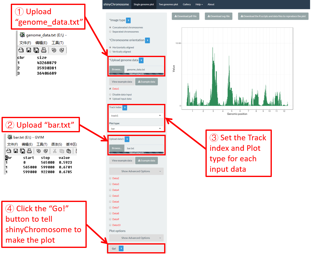
图 20. 使用shinyChromosome绘制柱状图的过程。
4.6.4 绘制渐变型矩形图
利用shinyChromosome绘制渐变型矩形图需要两个输入文件:基因组数据文件和定义每个基因组区间的位置和值的输入文件。绘制渐变型矩形图最基本的数据集应该包含4列:染色体ID、基因组区间的起始坐标、基因组区间的结束坐标和每个矩形的值。第4列应该是表示连续变量的数值向量。在这里,我们使用shinyChromosome源代码中提供的示例文件 “genome_data.txt” ( https://github.com/venyao/shinyChromosome/blob/master/www/data/download_example_data/single_genome/genome_data.txt ) 和 “rect_gradual.txt” ( https://github.com/venyao/shinyChromosome/blob/master/www/data/download_example_data/single_genome/rect_gradual.txt ) 来演示使用shinyChromosome绘制渐变型矩形图的过程 ( 图 21 )。请注意,要将“Image type”设置为“Separated chromosomes”来分割12条染色体。
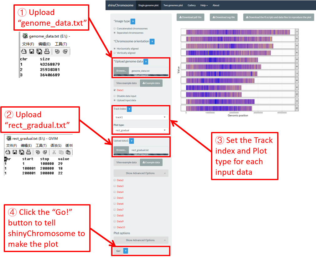
图 21. 使用shinyChromosome绘制渐变型矩形图的过程。
4.6.5 绘制离散型矩形图
利用shinyChromosome绘制离散型矩形图需要两个输入文件:基因组数据文件和定义每个基因组区间的位置和值的输入文件。绘制离散型矩形图最基本的数据集应该包含4列:染色体ID、基因组区间的起始坐标、基因组区间的结束坐标和每个矩形的值。第四列应该是表示离散变量的字符向量。在这里,我们使用shinyChromosome源代码中提供的示例文件“genome_data.txt” ( https://github.com/venyao/shinyChromosome/blob/master/www/data/download_example_data/single_genome/genome_data.txt ) 和 “rect_discrete.txt” ( https://github.com/venyao/shinyChromosome/blob/master/www/data/download_example_data/single_genome/rect_discrete.txt ) 来演示使用shinyChromosome绘制离散型矩形图的过程 ( 图 22 )。请注意,要将“Image type”设置为“Separated chromosomes”来分割水稻基因组的12条染色体。
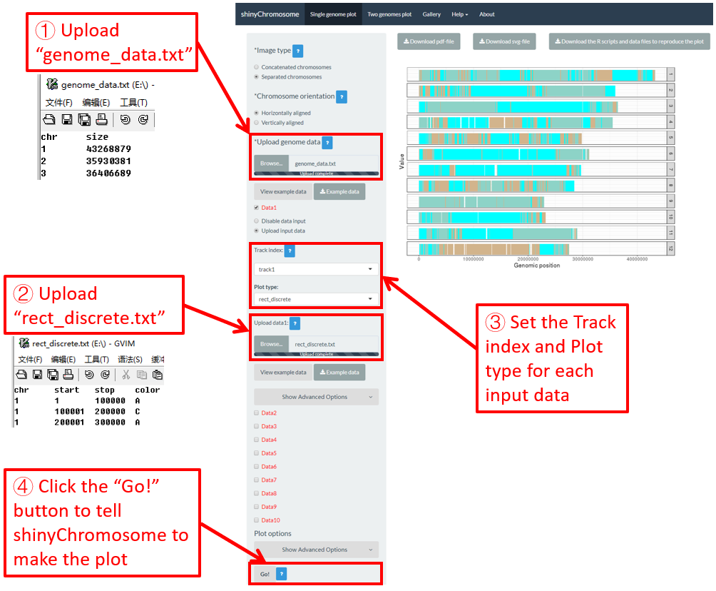
图 22. 使用shinyChromosome绘制离散型矩形图的过程。
4.6.6 绘制渐变型热图
利用shinychromosome制作渐变型热图,我们需要两个输入文件,基因组数据文件和定义每个基因组区域的位置和值的输入文件,每个基因组区域作为热图的一个单元显示。绘制渐变型热图最基本的数据集应至少包含4列。
-
渐变型热图的1-3列数据是染色体ID、基因组区域的起始坐标和基因组区域的结束坐标。
-
除前三列外,其他列应为表示连续变量的数值向量。
在这里,我们使用shinyChromosome源代码中提供的示例文件“genome_data.txt” ( https://github.com/venyao/shinyChromosome/blob/master/www/data/download_example_data/single_genome/genome_data.txt ) 和 “heatmap_gradual.txt” ( https://github.com/venyao/shinyChromosome/blob/master/www/data/download_example_data/single_genome/heatmap_gradual.txt ) 来演示使用shinyChromosome绘制渐变型热图的过程( 图 23 )。请注意,要将“Image type”设置为“Separated chromosomes”来分割水稻基因组的12条染色体。
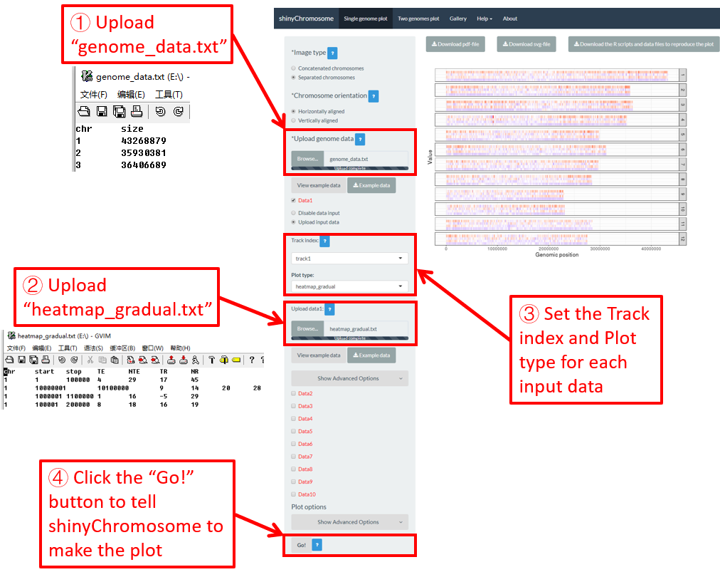
图 23. 使用shinyChromosome绘制渐变型热图的过程。
4.6.7 绘制离散型热图
利用shinyChromosome制作离散型热图,我们需要两个输入文件:基因组数据文件和定义每个基因组区域的位置和值的输入文件,每个基因组区域作为热图的一个单元来显示。绘制离散热图的最基本数据集应至少包含4列。
-
离散型热图的1-3列数据是染色体ID、基因组区域的起始坐标和基因组区域的结束坐标。
-
除前三列外,其他列应为表示不同类别的字符向量。
在这里,我们使用shinyChromosome源代码中提供的示例文件“genome_data.txt” ( https://github.com/venyao/shinyChromosome/blob/master/www/data/download_example_data/single_genome/genome_data.txt ) 和 “heatmap_discrete.txt” ( https://github.com/venyao/shinyChromosome/blob/master/www/data/download_example_data/single_genome/heatmap_discrete.txt ) 来演示使用shinyChromosome绘制离散型热图的过程 ( 图 24 )。请注意,要将“Image type”设置为“Separated chromosomes”来分割水稻基因组的12条染色体。
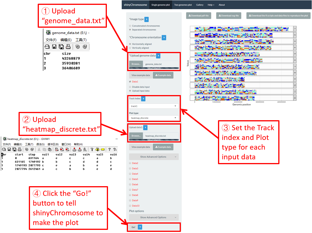
图 24. 使用shinyChromosome绘制离散型热图的过程。
4.6.8 绘制 text
要使用shinyChromosome绘制文本,我们需要两个输入文件,基因组数据文件和定义要沿基因组显示的文本位置的输入文件。绘制文本最基本的数据集应包含4列。
-
第1-3列数据是染色体ID、X轴坐标和Y轴坐标。
-
最后一列应该是表示文本的字符向量。
在这里,我们使用shinyChromosome源代码中提供的示例文件“genome_data.txt” ( https://github.com/venyao/shinyChromosome/blob/master/www/data/download_example_data/single_genome/genome_data.txt ) 和 “text.txt” ( https://github.com/venyao/shinyChromosome/blob/master/www/data/download_example_data/single_genome/text.txt ) 来演示使用shinyChromosome绘制文本图的过程( 图 25 )。请注意,一些高级选项已经修改,如 图 25 所示。并且,要将“Image type”设置为“Separated chromosomes”来分割水稻基因组的12条染色体。
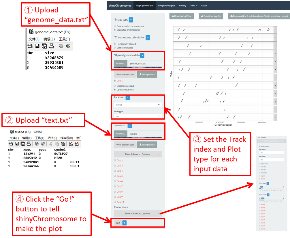
图 25. 使用shinyChromosome绘制文本图的过程。
4.6.9 绘制线段图
使用shinychromosome绘制线段图,我们需要两个输入文件,即基因组数据文件和定义沿基因组显示的线段的开始和结束位置的输入文件。绘制线段图最基本的数据集应包含5列。
-
第1列包含每个片段的染色体ID。
-
第2-3列和第4-5列分别代表片段两端的位置。
在这里,我们使用shinyChromosome源代码中提供的示例文件“genome_data.txt” ( https://github.com/venyao/shinyChromosome/blob/master/www/data/download_example_data/single_genome/genome_data.txt ) 和 “segment.txt” ( https://github.com/venyao/shinyChromosome/blob/master/www/data/download_example_data/single_genome/segment.txt ) 来演示使用shinyChromosome绘制线段图的过程( 图 26 )。

图 26. 使用shinyChromosome绘制线段图的过程。
4.6.10 绘制垂直线图
垂直线图通常与其他类型的图形混合使用。创建垂直线图的输入数据应包含两列。第一列是染色体ID,第二列是每条垂直线的X轴坐标。
在这里,我们使用shinyChromosome源代码中提供的示例文件“genome_data.txt” ( https://github.com/venyao/shinyChromosome/blob/master/www/data/download_example_data/single_genome/genome_data.txt ), “vertical_line.txt” ( https://github.com/venyao/shinyChromosome/blob/master/www/data/download_example_data/single_genome/vertical_line.txt ) 和 “bar.txt” ( https://github.com/venyao/shinyChromosome/blob/master/www/data/download_example_data/single_genome/bar.txt ) 来演示使用shinyChromosome绘制垂直线图的过程( 图 27 )。

图 27. 使用shinyChromosome绘制垂直线图的过程。
4.6.11 绘制水平线图
水平线图通常与其他类型的图形混合使用。创建水平线图的输入数据应包括一列,表示每条水平线的Y轴坐标。
在这里,我们使用shinyChromosome源代码中提供的示例文件“genome_data.txt” ( https://github.com/venyao/shinyChromosome/blob/master/www/data/download_example_data/single_genome/genome_data.txt ), “horizontal_line.txt” ( https://github.com/venyao/shinyChromosome/blob/master/www/data/download_example_data/single_genome/horizontal_line.txt ) 和 “bar.txt” ( https://github.com/venyao/shinyChromosome/blob/master/www/data/download_example_data/single_genome/bar.txt ) 来演示使用shinyChromosome绘制水平线图的过程( 图 28 )。
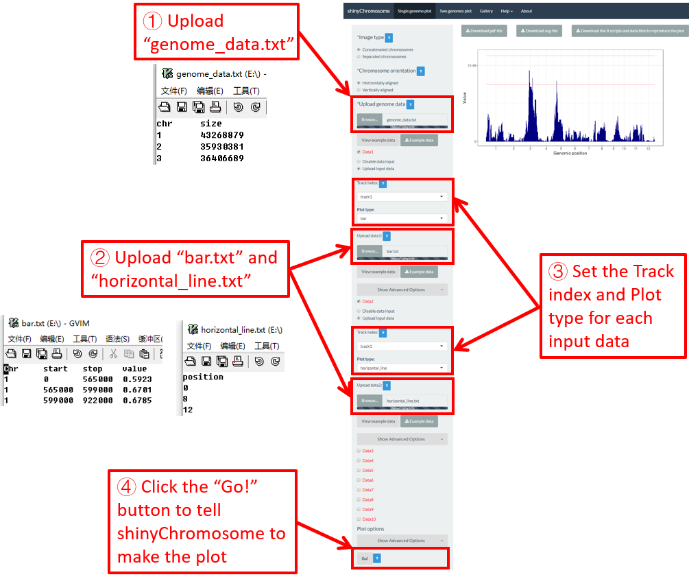
图 28. 使用shinyChromosome绘制水平线图的过程。
4.6.12 绘制 ideogram
Ideogram是染色体的图解表示。创建ideogram的输入数据应包含5列。请查看 https://www.nature.com/scitable/topicpage/chromosome-mapping-idiograms-302 和 http://genome.ucsc.edu/cgi-bin/hgTables?db=hg38&hgta_group=map&hgta_track=cytoBand&hgta_table=cytoBand&hgta_doSchema=describe+table+schema 获取更多信息。使用shinyChromosome绘制ideogram,需要两个输入文件:基因组数据文件和用来创建ideogram的输入文件。
在这里,我们使用shinyChromosome源代码中提供的示例文件“genome_data.txt” ( https://github.com/venyao/shinyChromosome/blob/master/www/data/download_example_data/single_genome/genome_data.txt ) 和 “ideogram.txt” ( https://github.com/venyao/shinyChromosome/blob/master/www/data/download_example_data/single_genome/ideogram.txt ) 来演示使用shinyChromosome绘制ideogram的过程 ( 图 29 )。 请注意,要将“Image type”设置为“Separated chromosomes”来分割水稻基因组的12条染色体。
图 29. 使用shinyChromosome绘制ideogram的过程。
4.7 利用 shinyChromosome 整合多个输入数据集创建高级单基因组图型
在第4.6节中,我们演示了使用shinyChromosome创建不同类型单基因组图形的过程。为了简单起见,我们在第4.6节的每个示例中只创建一种类型的绘图。实际上,shinyChromosome可以接受多达10个输入数据集来创建复杂的单基因组图形。每个输入数据集可用于创建12种不同类型的绘图中的任意一种。现在,我们使用shinyChromosome的“Gallery”菜单中提供的示例数据集“Example 1”演示使用shinyChromosome创建高级单基因组图形的过程( 图 30 )。
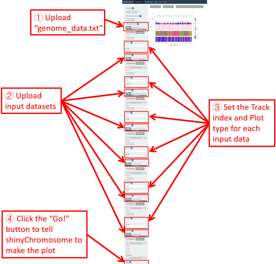
图 30. 使用shinyChromosome创建具有多个输入数据集的高级单基因组图形的过程。
一共有6个输入数据集分布在最终生成的图的5个轨道中。 图 30 显示了6个输入数据集的上传过程以及每个数据集的轨道和绘图类型的设置。除了在 图 30 中演示的过程之外,其他很多选项也被调整用来创建最终的图形,包括图形图例的显示、图形主题的设置和每个轨道的大小。这些选项的设置如 图 31 所示。

图 31. 使用shinyChromosome装饰图30中创建的图形的各种选项的设置。
4.8 修饰单个基因组图形的绘图选项
在“Single-genome plot”菜单的左侧面板中的每个“DataX”复选框下,提供了各种小部件来装饰生成的单基因组图的外观。下面将演示其中一些选项的设置。
4.8.1 相连的染色体 v.s. 分离的染色体
单个基因组图形中的所有染色体可以按顺序连接在一起,也可以通过在“Single-genome plot”菜单的左面板顶部“Image type”小部件设置为分离在不同的面板中。对于shinyChromosome应用程序的“Gallery”菜单中显示的“Example 10”和“Example 12”,输入数据集是相同的。在“Example 10”所示的图中,所有染色体按顺序连接,而在“Example 12”所示的图中,所有染色体分离在不同的面板中。 图 32 和 图 33 分别演示了创建“Example 10”和“Example 12”中所示图形的过程和选项设置。

图 32. 使用“Gallery”菜单中“Example 10”的输入数据集创建的所有染色体连在一起的单基因组图形。

图 33. 使用“Gallery”菜单中“Example 12”的输入数据集创建的所有染色体不相连的单基因组图形。
4.8.2 水平排列的染色体 v.s. 垂直排列的染色体
通过设置“Single-genome plot”菜单左侧面板顶部的“Chromosome orientation”小部件,可以设置使得单个基因组图中的所有染色体沿水平轴对齐,也可以使其沿垂直轴对齐。对于shinyChromosome应用程序的“Gallery”菜单中显示的“Example 10”和“Example 12”,输入数据集是相同的。在“Example 10”所示的图中,所有染色体沿水平轴对齐,而在“Example 12”所示的图中,所有染色体沿垂直轴对齐。 图 32 和 图 33 分别演示了创建“Example 10”和“Example 12”中所示图形的过程和选项设置。
4.8.3 设置点的颜色、大小和形状
对于点图,我们可以使用“Single-genome plot”菜单左侧面板中提供的小部件修改点的颜色、点的大小和点的形状。在这里,我们使用“Gallery”菜单中显示的“Example 17”的输入数据集来演示这些小部件。
默认情况下,点的颜色是系统随机设置的、点的大小和形状是系统预定义的,如 图 34 所示。如果要更改点的颜色、点的大小或点的形状,可以在“Color”、“Symbol” 和 “Size”复选框下编辑这些小部件的默认值,如 图 35 所示。
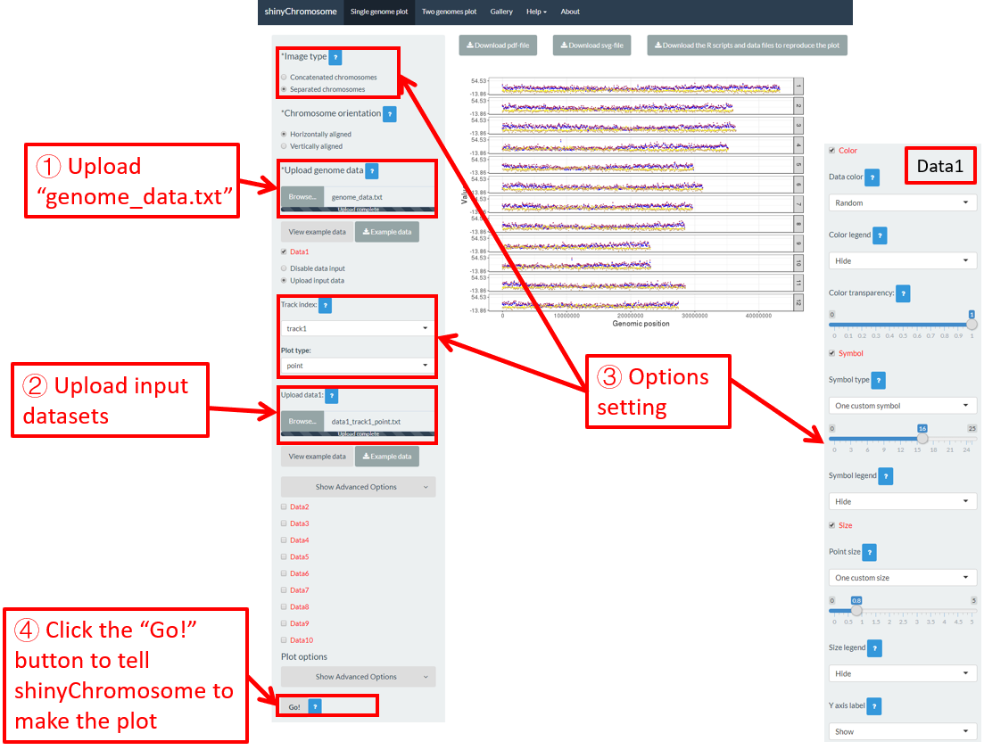
图 34. shinyChromosome中点的颜色、点的形状和点的大小的默认设置。

图 35. 在shinyChromosome中使用不同控件设置点的颜色、点的形状和点的大小。
实际上,“Example 17”的输入数据集包含一个“color”列、“shape”列和“size”列,用于指定点的颜色、形状和大小。要使用输入数据集中的“color”、“shape”和“size”设置点的颜色、形状和大小,需要在“Color”、“Symbol”和“Size”复选框下设置小部件的值,如 图 36 所示。
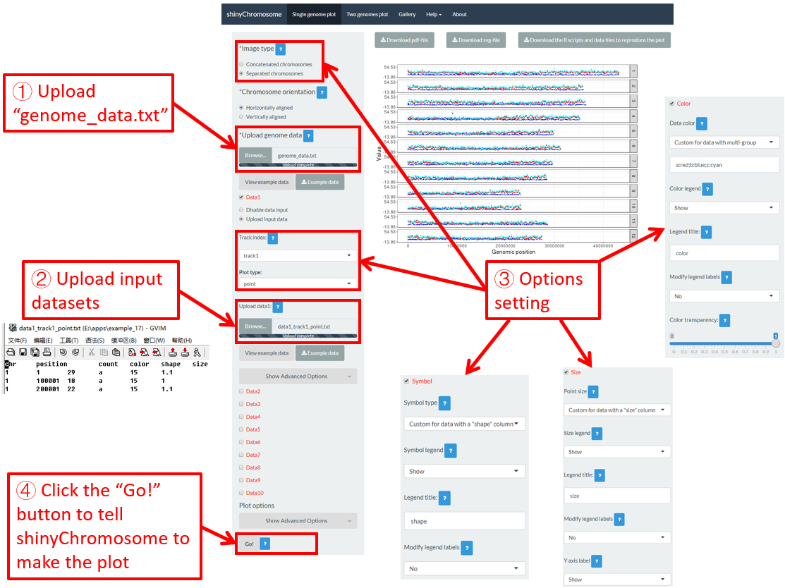
图 36. 使用shinyChromosome中输入数据集的“color”、 “symbol”和“size”列设置点的颜色、形状和大小。
4.8.4 为多个数据集设置矩形图的颜色
对于离散型矩形图,我们可以使用“Single-genome plot”菜单左侧面板中提供的小部件设置属于不同组的矩形的颜色。在这里,我们使用“Gallery”菜单中展示的“Example 37”的输入数据集来演示这些小部件。一共上传了三个输入数据集,生成了“Example 37”中的离散型矩形图。每个数据集的第四列是一个“color”列,用于定义每个基因组区域的组别,不同的组将设置为不同的颜色。默认情况下,颜色的分配是随机的,如 图 37 所示。如果要设置不同数据组的颜色,可以使用每个数据集对应的“color”小部件。该过程如 图 38 所示,包括各种选项的设置。
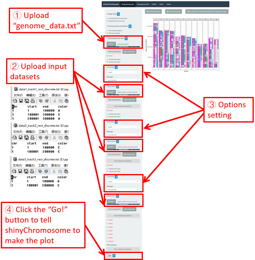
图 37. shinyChromosome中矩形颜色的默认设置。
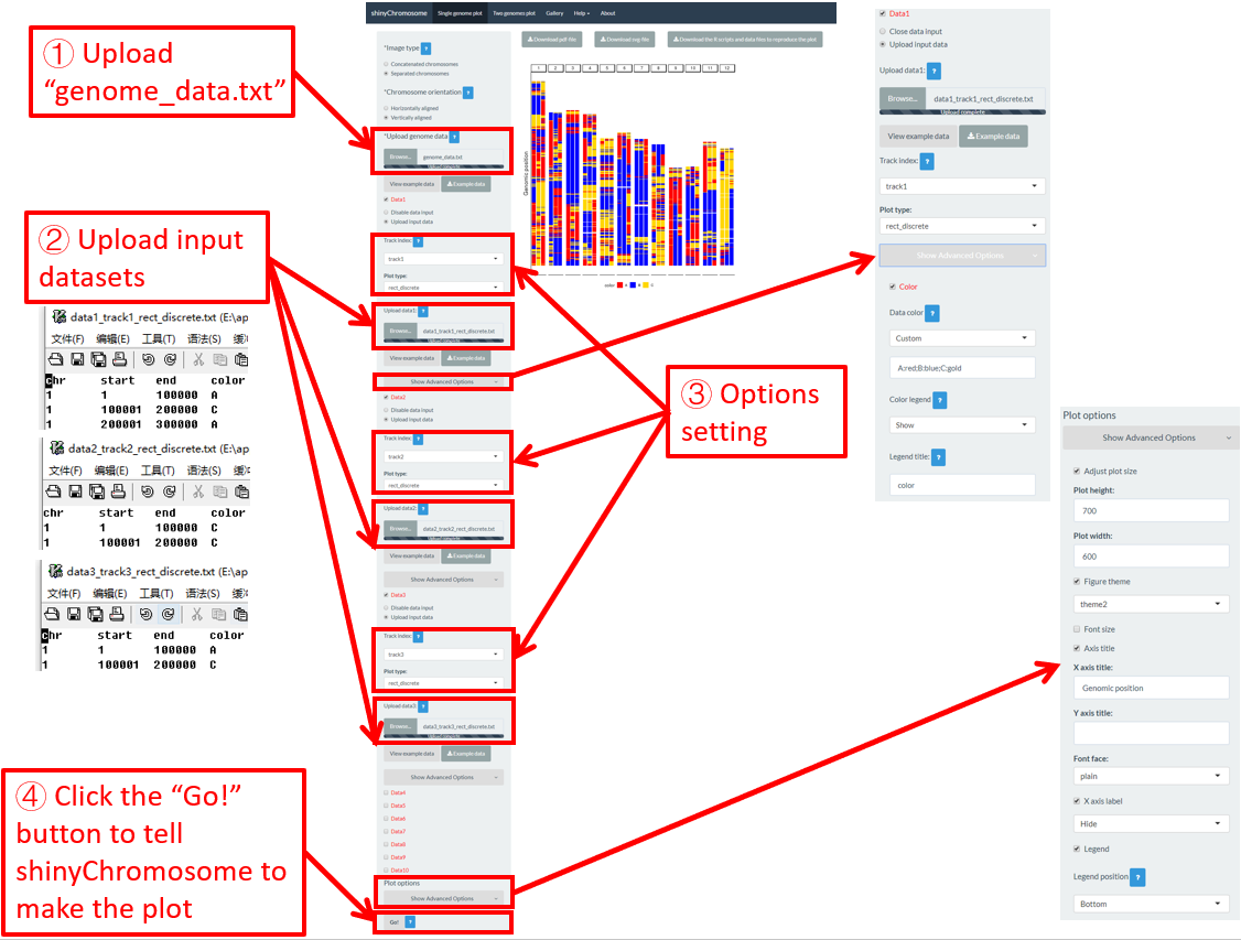
图 38. 使用shinyChromosome中输入数据集的“color”列设置矩形颜色。
目录
4. 利用shinyChromosome绘制非圆形的单基因组图形
4.1 创建非圆形单基因组图形的基本步骤
步骤 1. 准备并上传定义基因组长度的输入文件
步骤 2. 上传沿着所有染色体排布的其它数据集
步骤 3. 为每个输入数据集设置轨道位置和绘图类型
步骤 4. 点击“Go!”按钮绘制图形
4.2关闭用于绘制单个基因组图的输入数据集
4.3 替换用于绘制单个基因组图的输入数据集
4.4 以PDF或SVG格式下载创建的单个基因组图形
4.5 下载R脚本和用户上传的输入数据集,以重建单个基因组图形
4.6 利用shinyChromosome绘制不同类型的单基因组图形
4.6.1 绘制点图
4.6.2 绘制线形图
4.6.3 绘制柱状图
4.6.4 绘制渐变型矩形图
4.6.5 绘制离散型矩形图
4.6.6 绘制渐变型热图
4.6.7 绘制离散型热图
4.6.8 绘制text
4.6.9 绘制线段图
4.6.10 绘制垂直线图
4.6.11 绘制水平线图
4.6.12 绘制ideogram
4.7 利用shinyChromosome整合多个输入数据集创建高级单基因组图型
4.8 修饰单个基因组图形的绘图选项
4.8.1 相连的染色体v.s.分离的染色体
4.8.2 水平排列的染色体v.s.垂直排列的染色体
4.8.3 设置点的颜色、大小和形状
4.8.4为多个数据集设置矩形图的颜色
5. 利用shinyChromosome来绘制非圆形双基因组图形
为了绘制非圆形双基因组图形,您需要使用shinyChromosome应用程序的“Two-genome plot”菜单。创建双基因组图形需要三个数据集。第一个数据集定义了沿水平轴排列的基因组的长度。第二个数据集定义了沿垂直轴排列的基因组的长度。第三个数据集是用于创建双基因组图的主数据集。在下一节中,我们将演示使用shinyChromosome和示例数据集绘制非圆双基因组图形的所有基本步骤。
5.1 绘制非圆双基因组图谱的基本步骤
步骤 1. 准备并上传沿水平轴排列的基因组数据文件
基因组数据文件的格式与第4.1节所示的基因组数据格式是一样的。示例数据位于https://github.com/venyao/shinyChromosome/blob/master/www/data/download_example_data/two_genome/genome1_data.txt. 这个示例数据集被用于绘制图39中所示的图形。这个输入文件应该选择“Two-genome plot”菜单左侧面板中的“Upload genome1 data”控件来进行上传。
步骤 2. 准备并上传沿垂直轴排列的基因组数据文件
基因组数据文件的格式与第4.1节所示的基因组数据格式是一样的。示例数据组位于https://github.com/venyao/shinyChromosome/blob/master/www/data/download_example_data/two_genome/genome2_data.txt. 这个示例数据集被用于绘制图39中所示的图形。步骤1和步骤2中使用的输入文件可以是相同的文件,也可以是不同的文件。此输入文件应该选择“Two-genome plot”菜单左侧面板中的“Upload genome2 data”控件来进行上传。
步骤 3. 准备并上传主数据集
用于创建“Two-genome plot”的主数据集的详细文件格式在shinyChromosome应用程序的“Input data format”菜单中有详细描述。在这里,我们使用示例数据集 “point_gradual.txt” (https://github.com/venyao/shinyChromosome/blob/master/www/data/download_example_data/two_genome/point_gradual.txt) 来绘制图39中所示的图形。
步骤 4. 设置主数据集的绘图类型
绘图类型应被设置成“point_gradual” (图39)。
步骤 5. 点击“Go!”按钮来进行绘制
在所有输入数据集成功上传到shinyChromosome应用程序之后,我们需要单击“Two-genome plot”菜单左侧底部的“Go!”按钮来让shinyChromosome绘制图形(图39)。图39中的主面板中显示的图是使用步骤1、步骤2和步骤3中上传的数据集而生成的图。默认情况下,在绘制图形时,shinyChromosome使用的是随机颜色或是系统预定义的颜色。当您通过左面板中提供的各种小控件修改任何选项或输入文件时,记得点击“Go!”按钮来更新绘图结果。

图39.使用shinyChromosome绘制双基因组图的基本步骤。
5.2 利用shinyChromosome绘制不同类型的双基因组图谱
使用shinyChromosome总共可以创建5种不同类型的图形,包括渐变类型的点、离散类型的点、线段、渐变类型的矩形和离散类型的矩形。要创建双基因组图,至少需要三个输入数据文件。在shinyChromosome应用程序的“Input data format”菜单(在“Help”菜单下)中演示了用于绘制双基因组图的输入文件的详细格式。在这一节中,我们将演示使用shinyChromosome的图形界面和示例输入数据集绘制不同类型的双基因组图的关键参数。本节中使用的两个示例基因组数据文件与5.1节中使用的文件相同。 (https://github.com/venyao/shinyChromosome/blob/master/www/data/download_example_data/two_genome/genome1_data.txt, https://github.com/venyao/shinyChromosome/blob/master/www/data/download_example_data/two_genome/genome2_data.txt).
5.2.1渐变类型的点
输入数据集应包含5列。
第1列:沿水平轴排布的基因组的染色体ID。
第2列:沿水平轴排布的基因组中的位置。
第3列:沿垂直轴排布的基因组的染色体ID。
第4列:沿垂直轴排布的基因组中的位置。
第5列:定义每个点的值的数值向量。
使用shinyChromosome绘制渐变类型的点的过程如图39所示。
5.2.2 离散类型的点
输入数据集应包含5列。
第1列:沿水平轴排布的基因组的染色体ID。
第2列:沿水平轴排布的基因组中的位置。
第3列:沿垂直轴排布的基因组的染色体ID。
第4列:沿垂直轴排布的基因组中的位置。
第5列:定义每个点的类别的字符向量。
这里,我们使用shinyChromosome应用程序源代码中提供的示例数据集 “point_discrete.txt” (https://github.com/venyao/shinyChromosome/blob/master/www/data/download_example_data/two_genome/point_discrete.txt) 来展示shinyChromosome绘制离散类型的点的过程,如图40所示。
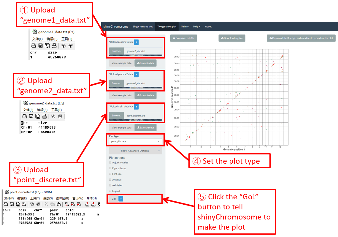
图40.用shinyChromosome绘制离散类型的点的过程。
5.2.3 线段
数据集应包含>=6列。在最简单的情况下,数据集应该包含6列,列的顺序是固定的。
第1列:沿水平轴排布的基因组的染色体ID。
第2列:线段的X轴起始坐标。
第3列:线段的X轴结束坐标。
第4列:沿垂直轴排布的基因组的染色体ID。
第5列:线段的Y轴起始坐标。
第6列:线段的Y轴结束坐标。
这里,我们使用shinyChromosome应用程序源代码中提供的示例数据集“segment.txt” (https://github.com/venyao/shinyChromosome/blob/master/www/data/download_example_data/two_genome/segment.txt) 来展示shinyChromosome绘制线段的过程,如图41所示。

图41. 用shinyChromosome绘制线段的过程。
5.2.4 渐变类型的矩形
数据集应包含顺序固定的七列。
第1列:沿水平轴排布的基因组的染色体ID。
第2列:矩形的X轴起始坐标。
第3列:矩形的X轴结束坐标。
第4列:沿垂直轴排布的基因组的染色体ID。
第5列:矩形的Y轴起始坐标。
第6列:矩形的Y轴结束坐标。
第7列:定义每个矩形值的数值向量。
这里,我们使用shinyChromosome应用程序源代码中提供的示例数据集“rect_gradual.txt” (https://github.com/venyao/shinyChromosome/blob/master/www/data/download_example_data/two_genome/rect_gradual.txt) 来展示shinyChromosome绘制渐变类型的矩形的过程,如图42所示。
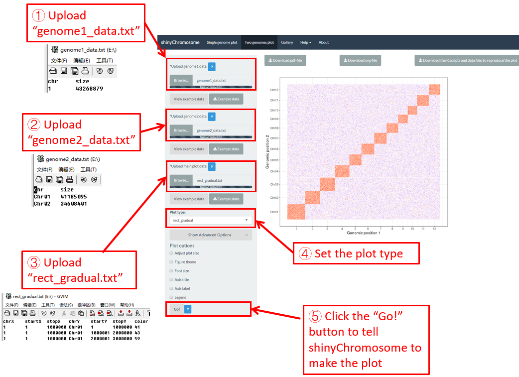
图42. 用shinyChromosome绘制渐变类型的矩形的过程。
5.2.5 离散类型的矩形
数据集应包含顺序固定的七列。
第1列:沿水平轴排布的基因组的染色体ID。
第2列:矩形的X轴起始坐标。
第3列:矩形的X轴结束坐标。
第4列:沿垂直轴排布的基因组的染色体ID。
第5列:矩形的Y轴起始坐标。
第6列:矩形的Y轴结束坐标。
第7列:定义每个矩形组别的字符向量。
这里,我们使用shinyChromosome应用程序源代码中提供的示例数据集“rect_discrete.txt” (https://github.com/venyao/shinyChromosome/blob/master/www/data/download_example_data/two_genome/rect_discrete.txt) 来展示shinychromosome绘制离散类型的矩形的过程,如图43所示。

图43. 用shinyChromosome绘制离散类型的矩形的过程。
6. 修改由shinyChromosome绘制的非圆形全基因组图形的外观
在“Single-genome plot”和“Two-genome plot”菜单的左侧面板中提供了许多小控件来修改使用shinyChromosome绘制的图的外观,包括图的大小、图的主题、字体大小、坐标轴标题、坐标轴标签和图例等。
6.1 图形大小
用户可以使用“Single-genome plot”菜单左侧面板底部的“Show advanced options”小控件下的“Adjust plot size”小部件调整单个基因组图形的高度和宽度。浏览器中和下载的PDF/SVG格式文件中的图形大小都会受到影响。在这里,我们使用第4.6.1节中演示的示例数据集来展示这此功能。单个基因组图的默认高度和宽度分别为550和750,在图44中修改为250和800。最后,我们需要点击“Go!”按钮来让shinyChromosome更新所绘制的图形。

图44. 利用shinyChromosome修改单个基因组图形的高度和宽度的过程。
6.2 图的主题
shinyChromosome使用ggplot2作图系统作为引擎绘制单基因组图型和双基因组图形。ggplot2包提供了许多选项来调整使用ggplot2绘制的图形的外观。具有预定义值的一组选项在 ggplot2 中称为图形主题。可以通过单个命令更改使用ggplot2所生成绘图的总体外观。ggthemes是一个R包,它包含数十个不同的主题,用于调整使用ggplot2所绘制的图形外观。ggthemes安装包提供的所有主题都可以在 https://yutannihilation.github.io/allYourFigureAreBelongToUs/ggthemes/ 上找到。ggthemes包被用于修饰shinyChromosome绘制的单基因组图形和双基因组图形的外观。在这里,我们使用4.6.1节中演示的示例数据集来展示此功能。单基因组图形的默认图形主题是shinyChromosome中的“theme1”,在图45中被修改为“theme18”。最后,我们需要单击“Go!”按钮让shinyChromosome更新所绘制的图形。

图45. 使用shinyChromosome修改单基因组图形的主题的过程。
6.3 字体大小
“Single-genome plot” 和“Two-genome plot”菜单左侧面板底部的“Font size”小控件可用于调整使用shinyChromosome绘制的图形中的字体大小,包括坐标轴标题的字体大小和坐标轴刻度标签大小。在这里,我们使用4.6.1节中演示的示例数据集来展示此功能。默认字体大小为16,在图46中被修改为30。最后,我们需要单击“Go!”按钮让shinyChromosome更新所绘制的图形。

图46. 使用shinyChromosome修改单基因组图形的字体大小的过程。
6.4 坐标轴标题
“Single-genome plot”和“Two-genome plot”菜单左侧面板底部的“Axis title”小控件可用于调整使用shinyChromosome绘制的图的坐标轴标题,包括X轴标题、Y轴标题和坐标轴标题的字体。在这里,我们使用第4.6.1节中演示的示例数据集来展示此功能。默认的坐标轴标题在图47中进行了修改。最后,我们需要点击“Go!”按钮让shinyChromosome更新所绘制的图形。
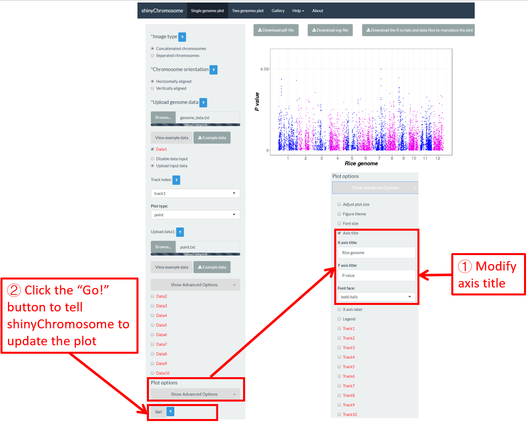
图47. 利用shinyChromosome来修改单基因组图形的坐标轴标题的过程。
6.5 图例
可以添加一个或多个图例来注释点的颜色、点的大小、点的形状、柱状图的颜色、热图的颜色等。默认情况下,不会将图例添加到使用shinyChromosome绘制的图形中。要添加图例,需要用户在“DataX”复选框下设置“Advanced options”。例如,要添加颜色图例,我们需要在相应的“DataX”复选框的“Advanced options”中将“Color legend”小控件的值设置为“Show”(图48)。
图例可以放在非圆形全基因组图形的右侧或底部。在“Single-genome plot”菜单的左侧面板底部总共提供了7个小控件,用于调整生成的图中所添加的图例的外观。这些小控件的含义如下所示。
Legend position:放置图例的位置。
Legend region size:图例大小相对于主画图区域的百分比。适用值为[0-1]中的数字。
Intra-spacing:不同图例之间的内部间距。
Title font size:图例标题的字体大小。
Title font face:图例标题的字体。
Label font size:图例刻度标签的字体大小。
Label font face:图例刻度标签的字体。
在这里,我们使用“Gallery”菜单中显示的“Example 17”的输入数据集来展示这些小控件(图48)。
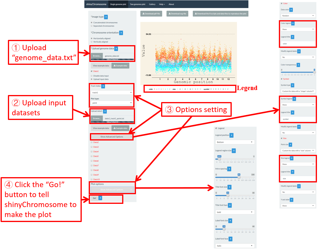
图48. 使用shinyChromosome将图例添加到单个基因组图形底部的过程。
6.6 不同轨道的高度和宽度
对于单基因组图形,我们可以修改每个轨道的高度和边距大小,以调整生成的图中每个轨道的大小。在这里,我们使用第4.1节中的输入数据集来展示这些选项的设置(图49)。
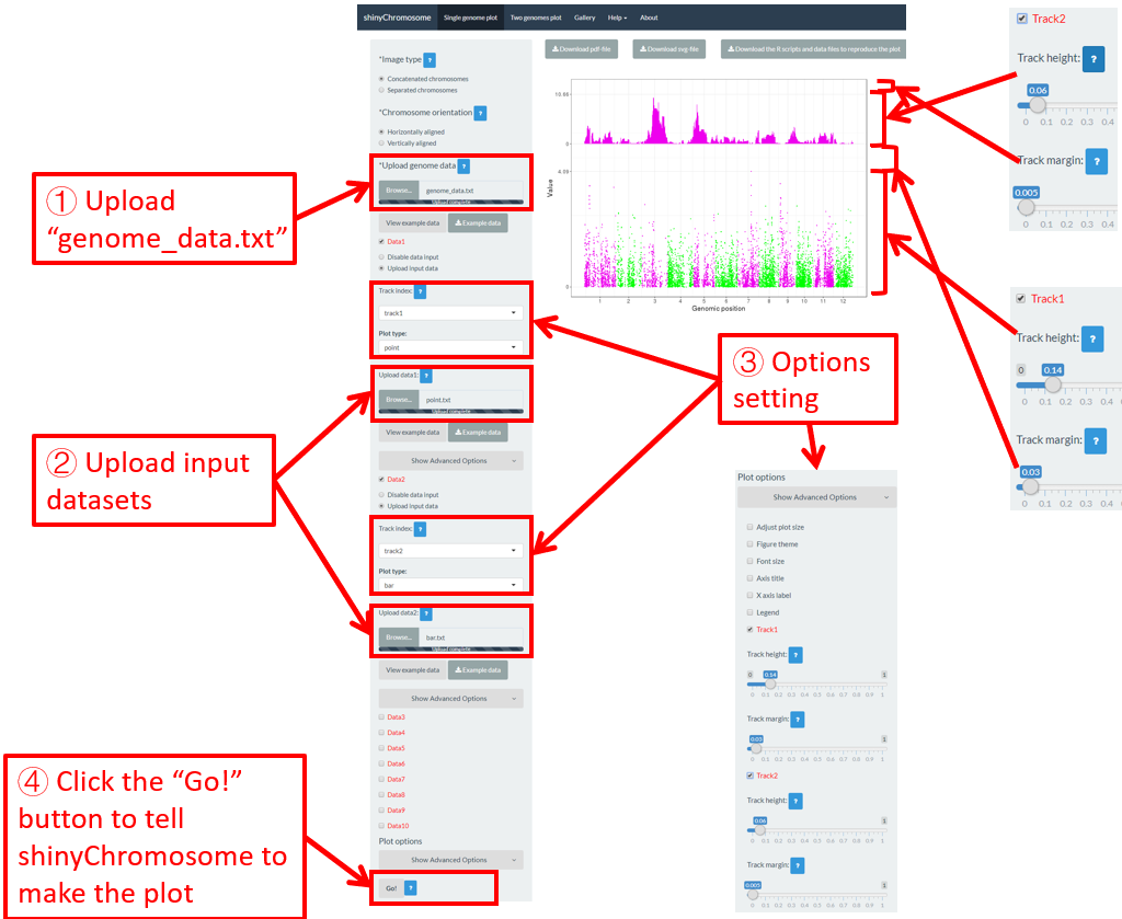
图49. 使用shinyChromosome修改单基因组图形的每个轨道的高度和边距大小的过程。